Monday, August 30, 2010
Copic Mondays - Cricut & Copic Roses by Laura Burleson
Today's video will teach you how to make these cute and easy flowers using your Copic Airbrush system and your Cricut Expression!
Products Available from Cutters Creek:
Cricut Expression
Cricut Cartridges - Paisley, Forever Young, Sweet Treats, Cindy Loo & many more
Copic Airbrush System
Copic Sketch Markers ( I used R81 and R85 along with R29 and R89 for this video)
Glue Dots
Monday, August 16, 2010
Copic Mondays - Airbrush System by Laura Burleson
I have only done one little Flip video with music in the background, so recording this and adding the titles, etc. was quite a chore. I had some huge problems with software, etc. Anyway, please excuse the mess-ups LOL I was so nervous. I made a few wrong statements trying to not stop talking on the video.
For clarification, the Airbrush system is a pre-order through Cutters Creek. I think I made it sound like Kim has them in stock for immediate shipment, but what I meant was she stocks them in her store. I hope that makes sense. Like I said, I am a bit fried from doing this. I started on it yesterday at about noon. I gave up trying to upload at about 3 a.m., and well, it is now almost 9 p.m., and the video is finally done.
I do hope you enjoy the video edition. Let me know if you prefer videos or regular blog posts. I would like to cater to my audience!
Copic Mondays - Airbrush System by Laura Burleson
Monday, August 2, 2010
Copic Mondays Colorless Blender & Blending Solution - By Laura Burleson
The colorless blender is probably the most mis-named item in the Copic Marker Toolbox. By saying blender, most people thing you can blend two colors together with it. In reality the Colorless Blender is actually just the plain alcohol that is used to dilute the marker colors. The blender "moves" the colors around. It doesn't actually blend them.
You can use this to your advantage in several ways. If you are coloring and image, and your color bleeds slightly outside the lines. Wait for the first color to dry, then push the color back using the colorless blender. Use small strokes, and be patient. You want to slowly move it by adding a little alcohol at a time. You don't want to saturate the area, because that will make the run worse.
The coolest thing you can do with the colorless blender is to make effects on your designs. Did you know you can use it to create a brick wall effect?
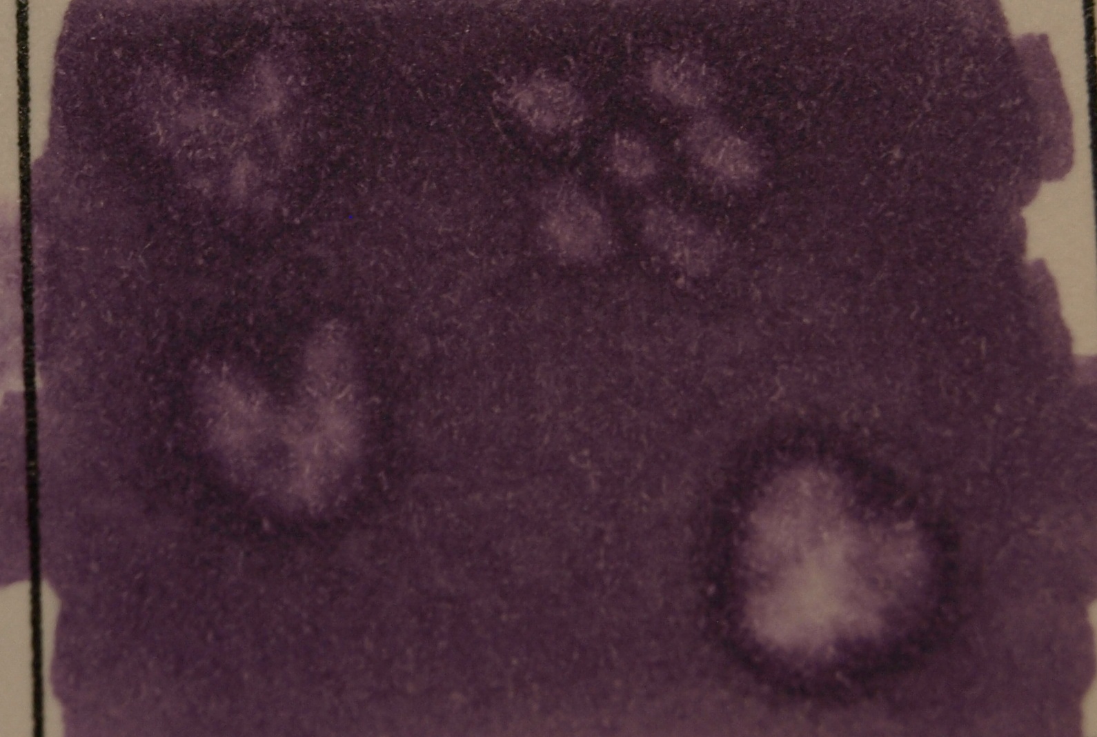
Color your "wall" using your favorite brick red. Then place the chisel end of your blender pen down flat on the colored surface to create bricks. Cool, huh? See how it pushes the color out to create the brick effect?
You can do a similar technique using the brush end of your marker to create flowers and hearts.
It does take some practice. Some of my flowers are better than others, but you get the idea. You can really see how the colorless blender pushes out the ink to create the image. You can see how the pushed ink pools to create an outline around your image.
So what else can you do? How about creating denim jeans on one of your stamped images? You will need a piece of denim a little larger than the jeans on the stamped image and a colorless blender refill or bottle of colorless blender fluid. Color the jeans first when using this technique. Color them normally with your favorite blues. I like to use B91, B93, B95 and B97. Dampen the denim. You want it damp, but you don't want it saturated. I like to stretch the denim on a stamp block to get perfect denim jeans, but you can just press the area with the damp denim. It will leave the denim imprint on your image. Another great detail for your artwork!
How about animals? Do you color them, but wish they looked more "furry"? Take a small scrap of terry cloth and get it damp with blending solution. Dab it on the stamped image to give it texture. See how my bear looks more like fun then just a colored image.
You can also use the terry cloth to create texture for grass or for mountains. I hope it is easy for you to see the light and dark areas that the blending solution creates to give a texture appearance.
Think of all the fun things you can try using blender ink! I would love to see your projects trying out any of these fun techniques!
Next time -- we will be checking out the Copic Airbrush System!
Monday, July 5, 2010
Copic Mondays - The Color Chart - What does it Mean? By Laura Burleson
We all pretty much know that Copics are numbered using a letter code and two number codes. The letter represents the color family:
Primary Colors:
- B = Blue
- R = Red
- Y = Yellow
Secondary Colors:
- G = Green
- V = Violet
- YR = Yellow Red
Tertiary Colors:
- YG = Yellow Green
- BG = Blue Green
- RV = Red Violet
- BV = Blue Violet
Earth & Tonal Colors:
- E = Earth
- C = Cool Gray
- T = Toner Gray
- N = Neutral Gray
- W = Warm Gray
The first number represents the tone of the marker of the color. The zero means pure color. There is no gray tone added to the color. A marker with the first number of 2, contains a bit of gray along with the pure blue color from the 0 series. A B9 marker contains the most gray tone mixed with the pure blue.
The second number is the intensity of the color. The smaller the number means the marker has a lighter color. There is more alcohol than ink in the lighter colors. The larger the number, the higher the ink concentration.
A B09 marker is a pure true blue marker with the least amount of ink in the color. It is the deepest true blue color. All of the markers from B0000 to B09 contain the same ink color, the concentration of the color is just lighter or darker.
So what does all this mean? Well, if you wanted a nice blue ball, you may use B05, and then the shadow of the ball would be more gray (since there is less light on the shadow of the ball). For the shadow you would use either B45 or B95. Both have the same intensity of the B05, but they have more gray in them (approx 40% gray for the B45, and 95% gray for the B95.
Say you wanted to color a beach ball. Beach balls usually have bright pure colors. You would want to choose colors with the closest numbers possible. In this example, I would use the primary colors of red, yellow, blue and green for my beach ball. I would use marker numbers B05, G05, Y06 (since there is no Y05), and R05. Those colors are bright and clear. They are perfect for a beach ball.
If you are looking to add normal high and low lights to a color, you want to use colors a few numbers apart. There isn't enough visible color variance with colors whose numbers are only one number apart. For example, it is difficult to see the difference between E31 and E32 in a small image. You would want to use E31 and E33 for the difference to be visible.
Well, that covers the colors and color chart, but what about the gray scale markers and toners? What gray scale toner family should you invest in first? If you select the neutral gray color family, you can use it with your warm and cool colors.
When you really understand what the color numbers mean, it is much easier to select colors that compliment, contrast, and shadow each other. You can make wise choices on colors to maximize your budget. Like we discussed before, when you select any color family, you want to choose at least three markers from that color family. You want a light color, a medium and a dark to allow for contrast and shading on your images. In previous articles, I have given many examples of color family choices for the most popular colors and applications.
Next time, we will be talking about the fun and techniques you can achieve with the Colorless Blender and the Blending Solution.
Please, ask questions or make suggestions for any topic you would like to see covered in Copic Mondays.
Monday, June 21, 2010
Copic Mondays: Marker Basics by Laura Burleson
Which Copics are best? It is a common question that is asked by anyone considering the investment in these great markers. I know I wondered myself, why would someone pay over $6 for a marker. Then I tried them! I fell instantly in love with the way they color and blend. Trust me, buying PrismaColor or Sharpie markers are no where near close. They might all be alcohol markers, but not all markers are equal in quality. Copics are non-pilling. They blend evenly without destroying the paper.
With Copics, they are literally a lifetime marker. You can replace the nibs, and refill the inks on all of your markers. Ink and nib replacements are inexpensive to do, and you have a lifetime of service. Once a Sharpie or Prismacolor runs out, you have to throw it away and buy a new marker.
All Copic markers have a guaranteed 3-year shelf life. The color consistency between all of the lines is completely guaranteed by Copic. If you buy RV00 in a Ciao, Sketch and Original, all of those colors will be the same.
All Copic markers are low odor, and are easy to clean up using an hand sanitizer with alcohol or alcohol wipes.
So you know "why" Copics, but now the question is which marker is best for me?
Ciao
The Ciaos are the least expensive of the Copic Markers. The hold the least amount of ink of all the Copics. Their shape is round, rather than oblong. They will roll off of you work surface. The marker caps do not have the color number on them, but the cap is color is the marker color. The nibs on the Ciao and the Sketch markers are the same. The Ciaos come in a total of 144 colors, and there will not be any new colors added to the Ciao line. The Ciaos will not work with the Copic airbrush system. They are a great economical choice.
Do be careful if you purchase the Ciao markers. Each marker has a ring inside the cap with air holes. This is to prevent choking should anyone accidentally swallow the cap. When putting your caps on your markers, be mindful of the rings inside. You do have the potential to damage the marker tip if you don't line it up correctly in the cap.
Sketch
The Sketch are by far the most popular of the Copic marker line. In fact, card makers and scrapbookers are the fastest growing market for Copics overall. The Sketch markers hold a full 2 oz. of ink. They come in 334 colors with new colors due on the market very soon. No other marker set has this many color options available. The Sketch markers can be used in the Copic airbrush system. They are created with an oblong shape with prevents them from rolling off of your work surface. Each end of the marker has the marker color number printed on it. Like the Ciao the cap is the color of the marker. The gray ring on one side indicates your brush tip side of the marker.
Original
The Copic Original markers have a medium broad tip and a fine tip. They are great for lettering, journaling and small images. The fine tip allows you to create very detailed artwork. Because they don't have the brush tip like the Ciao and the Sketch, you cannot do techniques such as feathering. Oringials come from the factory in 214 colors. There are empty markers available, so the line is expandable to all 334 colors by using the empty markers and the refill inks. They are compatable with the airbrush system.
Wide
These are great for large areas. They are easy to refill. Due to the extremely large 3/4" nib, they use a lot of ink. The 3/4" nib comes in two style: the Calligraphy nib and the Standard Broad nib. The Wide markers come in 36 popular colors, but like the Originals they are expandable to all 334 colors using empty markers and the ink refills. These are great for coloring large areas. They are excellent when used for backgrounds, calligraphy and architectural design.
Ink Refills
Ink refills are available in all 334 Copic colors. How many times will one ink refill fill up your marker? Here is the chart:
Since the Ciao holds the least amount of ink, you will be able to refill it 15 times with one refill bottle. The Sketch marker can be refilled 12 times, and the Original 9 times.
Nibs
You can change the nibs on your markers. The Ciao and the Sketch both come with the Medium-Broad and Super Brush nibs. The Original marker comes with the Medium-Broad and Fine nibs. The Wide marker comes with the Calligraphy or Chisel nib.
Ciao nib options:
Sketch nib options:
Original nib options:
I hope this really brings together some marker basics for new Copic customers, and answers some basic questions for those of you that already love these markers like I do. In future articles, I will bring you information and uses for the multi-liner pen, Atyou Spica Glitter pens, the Colorless Blender, and the Colorless Blender solution.
Remember the complete line of Copic Markers are available in the Cutters Creek store.
**Credits - information from Copic International, Jennie Lin Black, and I like Markers. Photos courtesy of Copic International.
Monday, June 7, 2010
Copic Mondays-More Copic Basics by Laura Burleson
Did you know that some inks can ruin your Copic Markers?
Are some papers better than others for coloring your images?
Did you know that you can actually ruin your markers coloring on some surfaces?
If you are like me, I had no idea that some basic items I use for crafting could be damaging to my Copic markers. Granted, you can replace the nibs, so damage wouldn't be permanent. Still, I would rather do all I can to prolong my marker's life.
Copic markers have a shelf life of three year when kept properly capped. I know I would never let mine sit that long without use, but it is nice to know that they are made to last.
Okay, back to inks. Copic officially endorses using Tsukineko Memento or Brilliance Inks, Tim Holtz (Ranger) Distress Inks, A Muse Ink, and Stewart Superior Palette Noir Ink. Cutters Creek carries both Tsukineko Inks and Ranger Inks. You can add clear embossing powders or heat set the inks for your best results. Embossing inhibits the "running" or "bleeding" of your inks when coloring. Never use colored embossing powders. Colored powders react with the markers. Never use solvent based inks with your Copic Markers. These products are intended for use with water-based media, and they don't work well with Copics. Staz-On inks will stain will run and make a messy image, but worse yet, it ruins the nib on your markers. Stampin' Up, Close to My Heart, and other water based inks will run and discolor the nibs on your markers.
There is only one time you would use Staz-On inks with your Copics. If you wanted to color a vellum image, you would stamp the image on the front (glossy) side of your vellum. You then color the image from the back (rough) side of the paper using your Copics.
Now as for paper. Choosing a good paper is very important. You need one that allows the ink to soak into the paper, but also allows you to move it around while you are coloring. When a paper is super glossy, the ink will just float on the paper. It doesn't stick or soak into the paper. If a paper is too soft, then you aren't able to control the ink. It will bleed outside your image lines too quickly. You want to test your paper for saturation and bleeding before using it to color a project.
Copic International recommends two main papers for coloring with your Copic Markers, Bazzill (Prism) Simply Smooth Cardstock in Ivory or Neenah Classic Crest Solor White or Ivory 80# Cardstock. Bazzill papers are available from Cutter's Creek in both white and ivory. These papers absorb your inks beautifully without feathering too quickly. They allow you to work well with wet inks and blend your colors so nicely. You won't believe the difference!
Lastly, let's visit things that can ruin your Copic Markers. Never color over any glitter pens except your Atyou Spica pens. The Spica pens are made with special glass glitters that will not clog or gum up your marker's nib. Never color over Opaque White, White Out, Acrylic Paints or gel pens. These will ruin the marker ends, and once clogged, the inks will not flow properly onto your projects. White out has actual paper fibers in the liquid that will glob up in the marker tip. Color your projects first, and then add any gel pen accents. If you have colored over these products, don't worry. Your marker nibs are replaceable.
Copics are amazing markers. All of the basics to get you started are available at the Cutters Creek Store. If you need help selecting markers, papers, or inks, please ask. Kim or I will be happy to assist you!
Cutters Creek always stocks:
Copic Markers
Copic Spica Pens
Replacement Nibs and Nib Tweezers
Tsukineko Memento or Brilliance Inks
Tim Holtz (Ranger) Distress Inks
Bazzill Cardstock
Resources: Copic Markers/Imagination International Inc., Marianne Walker, and Jennie Lin Black, Regional Certification Instructors
Monday, May 24, 2010
Copic Q & A: Refilling your markers ~By Laura Burleson
There are three basic refill methods:
Method One:
Add drops of refill ink slowly to your chisel end of the marker. Allow the marker to absorb the inks. It will drink and drink until it is "full".
Method Two:
Remove the chisel nib, and add drops of ink into your marker. Use the Copic Tweezers to remove the nib to prevent damage. Never refill your marker by removing your brush nib. The brush nib is much more delicate than the chisel end.
Method Three:
Copic makes a needle attachment that screws into the refill bottle. You can inject ink into the chisel end of the marker using the needle. The needle can be re-used, but it must be cleaned completely after each use to avoid cross contamination of your inks and markers.
A completely empty Copic Sketch marker will take 2 c.c.'s of ink. If you over-fill your marker, you can absorb some of the ink out of the tips by using an old towel or paper towel. Overfilled markers will blob when you color with them. If you know your marker is not overfilled, but it is still "blobbing", you may have a pressure problem. Remove the caps from both sides of the marker to allow the marker to equalize its pressure. This usually happens due to changes in temperature, climate, or altitude.
How do you know your marker needs to be refilled? When your nibs are white, and ink isn't flowing to the tips.
Do you have more questions about Copic Markers? Please post them! I will be happy to answer any and all questions!
Laura B. - Copic Certified Designer
Items available at Cutters Creek:
Copic Ciao and Sketch markers
Refillable Copic Liner Pens
Copic Ink Refills
Copic Replacement Nibs
Copic Nib Tweezers
Monday, May 3, 2010
Copic Mondays-More Marker Basics
We have been talking about coloring and color combinations in our recent articles. Are you new or relatively new to Copics? Do you have a bunch of markers, but you really aren't sure what ones to purchase next?
In Wendy's first Copic Mondays article she took you all through each type of Copic Marker. She explained the difference between Sketch, Ciao, and the Spicas. She also reference the Copic Color Wheel, remember? Did you all print one out?
This has to be my single most valuable Copic resource. I have the chart printed on the two main cardstock papers I use for my stamped images. Each tine I get a marker, I color in that box on the chart. Now you are probably saying, "Why on earth does she do two of those?" Well, your markers will color slightly different on each cardstock that you use. Sometimes it is a subtle difference, but it can be different. When you are trying to make that perfect project, it is important to know how your markers are going to color on your chosen materials.
Of course you don't need to make a full chart to check colors on every single project. It is, however, a good idea to check your colors on a scrap sheet of paper before coloring on your project.
Here are samples of my two main charts:
I know it is difficult to see the subtle differences in the photos, but there is a difference in the coloring on the two pages.
So how do you know what colors you want before you purchase?
When selecting your first colors, you want to buy in lots of three in your color range. As Wendy discussed, it gives you an option for a highlight color, main color, and shading color. My biggest question was still, "Okay, so which ones?"
Last week we covered my favorites for hair colors. In week 3 we looked at skin colors. So this week here are some of my other favorite color combinations:
Pinks: R81, R83, R85 (Mauve pink) or RV02, Rv21, RV23 (Girly Pink)
Oranges: YR00, YR12, YR16, or YR18 (Pumpkin Orange)
Yellows: Y00, Y11, Y21 (Buttery Yellow)
Yellow-Red: YR21, YR23, YR26 (Mustard Yellow)
Reds: R02, R22, R27 (True Red) or R22, R24, R29 (Rich Red)
Blue (for jeans): B91, B93, B95 or B97
Blue Green (Water) BG10, BG11, BG13
Lavender: V01, V12, V15 or V17
Yellow-Green: YG01, YG23, YG25 or for a softer look YG01, YG13, YG17
Green: G40, G21, G24 (Mossy Green) or G40, G94, G99 (Olive Green)
Brown: E31, E33, E35, E37
Blue: B24, B26, B29
For Shadows use C1, W1 or T1
Here is what they look like grouped together:
I hope this helps to give you a better idea of selecting colors in groups for highlighting and contrast. Leave me a comment to let me know what you would like to see in future posts on Copic Markers. I can't wait to attend the certification class and share more great techniques with you! Happy Monday~
Laura
All markers used in this post are Sketch Markers by Copic. All markers are available from Cutters Creek. The cardstock used was the Bazzill (Prism) white cardstock.
Monday, April 26, 2010
Copic Monday-Hair Coloring by Laura Burleson
For blond hair, I use YR23, Y23 and E35.
For brunette hair, I use E29, E25, and E31.
For auburn hair, I use E13, E17, and E19.
For black hair, I use C3, C5, and C9.
For grey hair, I use C1, C3, and C5.
This is a completed example of blond hair using the Y23, YR23 and E35:
When coloring hair use the same technique used for the skin. Lay down your lightest color for the entire head of hair. Next add in your darkest color, then your mid-range color. For images like the Pink Cat Studios characters, you will not have a lot of hair color definition.
This image shows a completed brunette using E25, E29, E31.
When coloring images more detailed images with more hair color lines, you will be able to add more depth to your hair color. You will have a greater area and more hair texture to cover. When you have images that have definite hair strand lines. Use strokes in those same directions to give the hair flow. Practice making short controlled strokes before starting to color your image.
For this image I started with my Y23 for blond hair. I used strokes that followed the natural hair growth.
After laying down my lighter color as the base. I added in my YR23 color. Again following the lines of the hair growth. Remember you can always go back and add more coloring as you progress through each step.
Lastly I added in my darkest color. I started from the roots of the hair and made it a bit darker using short feather-light strokes. I used more dark near the neckline and back of the hair. Remember your light source like we discussed previously. You want to layer in your darker colors where the hair would naturally be darker.
Here is a second example using the Auburn hair colors and the same image.
Coloring hair is an easy technique to master when you have the right colors. For all of my examples, I used the brush end of my Sketch Copic Markers. Enjoy trying these techniques! Please post your images. I would love to see your work.
Thanks for looking~
Laura
Cutters Creek Products Used:
Copic Sketch Markers - Colors listed above
Pink Cat Studios Stamps
Bazzill (Formly Prism) Cardstock
Memento Ink (Tuxedo Black)
Monday, April 19, 2010
Copic Mondays Installment #3
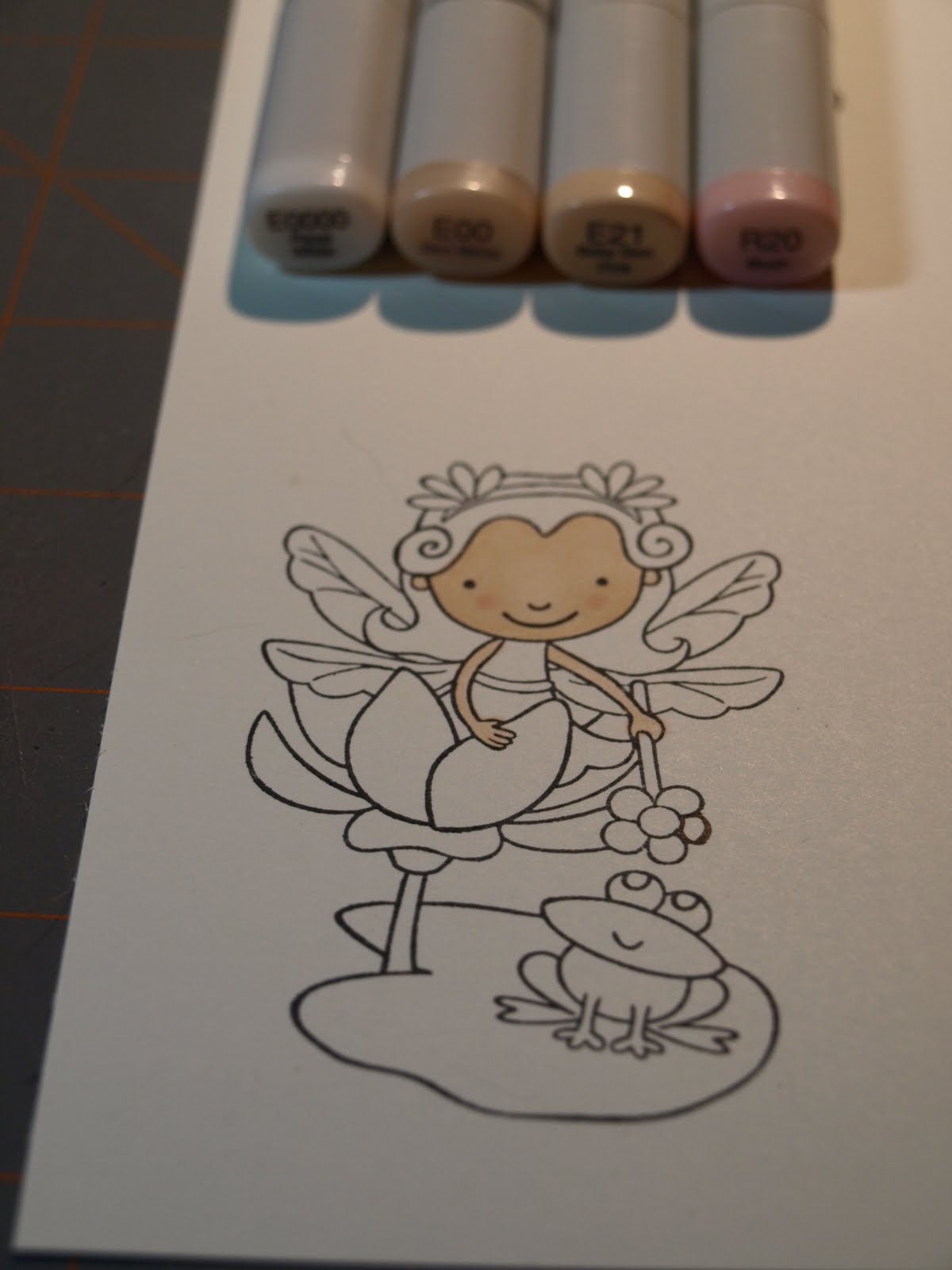
One of my first questions was, "Well, that is great, but how do I make the skin look like skin or the jeans look like jeans?" Like many of you, I wanted to be able to color basic images I had in my "stash" or ones I had traded with others.Today let's start with the skin tones. I had heard I needed E000, E00, E11, R20 (Blush) for skin, but how do I combine those to really make it look like skin? Could I do it? I was surprised the answer was yes. Let me show you what I learned!
First stamp your image on quality cardstock using a good ink like Memento Black Ink. I love the Bazzill cardstock at Cutter's Creek, and that is what I used. The stamp in this project is from Pink Cat Studios (Enchanted Lily Collection).
First you want to cover the entire area using your E000 or E0000. You don't have to worry about perfection, here. You are putting down your "base" coat. Work in small circles to get good coverage. Take your time, and get the feel of your pens.
Next we are going to add in E00. Again working in small circles. Choose where your light source will be, and leave those areas of the face lighter in your coloring. For my project, the light was coming straight on to Lily's face. I let her nose and forehead be slightly lighter than the rest of her face.
Next I added my facial shadows using E21. Around the hairline, the lower part of the face and ear area would all be the darker parts of the face. This is a a subtle variation in color. I lightly outlined the areas I wanted darker. Go sparingly. You can always return and add more color if you feel your shadows aren't quite right.
To give her cheeks a cute "glow", I reached for my R20. I made two small circles of blush area on her cheeks. I like this technique for cartoon type images.
Next I returned to my E00 to blend the colors together. Again, I kept the areas of the nose and center forehead lighter.
For her arms I used the E00 and the E21 for some shadow with the same technique.
Next time we are going to do the hair colors. I am going to cover the basic colors you will need for blond, brunette and auburn and black hair colors. I will be making Lily a blond, but you can do any hair color you choose.
Thanks for following along! I can't wait for the next installment!
Cutters Creek Products Used:
White Bazzill Cardstock
Copic Sketch Markers, E000 (or E0000), E00, E21 and R20
Memento Black Ink
Pink Cat Studios Stamps - Enchanted Lily