Showing posts with label Prism Cardstock. Show all posts

Monday, July 19, 2010

Dream Card w/ Cuttlebug Folders


Kim at Cutters Creek has these great Oriental Weave Embossing Folders from Cuttlebug. She was so kind, and sent me one to try. I love this folder. The others in the set of four are amazing, too. I gathered up a few supplies I thought would work well with this folder, and got to work.

I made my standard card base out of black cardstock. I used a piece of Black Magic Core'dinations paper for the embossing. I then sanded the image to reveal the blue color under the black. I also sanded the edges to give the piece a framed look. I love the way this looked done in the Black Magic with Blue undertones Core'dinations.

If you haven't tried Core'dinations for embossing, you really should. I love the look of the dual tones, and the amazing texture. Core'dinations papers have one color on the front, and another on the back. When you emboss, the back color comes up through the textured cardstock. There are many great varieties of this paper. Be sure to check them out on the Cutters Creek Store site.


I added the embossed piece to my card with my ScorTape. Next I made strips of patterned paper and layered them on top of black cardstock. I layered them on my card using my Glue Glider Pro, and my Foam Tape. Lastly, I cut out a Kanji for Dream out and then layered it with patterned papers and black cardstock.


For the inside of the card, I used a piece of Bazzill Prism White cardstock. I inked the edges and then adhered it to my card using ScorTape. Next I layered a sanded strip of the Core-dinations paper to a strip of black cardstock. I layered patterned paper and black cardstock on a larger piece and then I layered the word "Dream" on patterned paper and black cardstock. I added the dream using foam tape to give it dimension.

This was a fast simple card that will fit for a variety of occasions. I love the beautiful embossing folder, and the simplicity of this card.

Products available at Cutters Creek:

Cuttlebug Plum Blossom Embossing Set of 4 Folders
ScorPal
ScorTape
Core'dinations Black Magic Cardstock
Bazzill White Cardstock
Glue Glider Pro
Foam Tape Squares

Tuesday, July 6, 2010

Asian Inspired Birthday Card by Chris


I have several embossing folders and hardly ever use them. So, I challenged myself to put them to good use on upcoming projects. Here I’ve made a birthday card for my DIL, using the cherry blossoms from the Plum Blossom set.

I love to work with smaller A2 cards so put my A2 template down. Using my planning template, I pulled out my scraps and started laying pieces until I found a combination I liked--Core’dinations and a floral print. (I keep handy a set of white cardstock cut to different card sizes (just the front—4.25x5.5, 4x4, 5x7,etc) to use as planning templates when laying out a card. I just find this an easy way to fiddle around and not worry about marking up the final card base.) I cut the floral scrap to 2x4.25 and the Core’dinations to 3x4.25. I ran the Core’dinations through my Cuttlebug and sanded. Using my ATG, I glued the pieces next to each other on a white card base.

Digging into my ribbon stash, I found a quarter inch ecru ribbon, which I adhered with ScorTape. The card was looking a bit too blah for me, so I pulled out my various cricut cartridges and searched for a flower that would set off the embossed side and repeat the image of the cherry blossom. I found it on the Home Décor cartridge and cut it out of a pink scrap at 2.5 inches.

I found the sentiment on the internet and then decided to use SCAL and gelpens to write it on Prism Ivory cardstock. I then used Labels 10 Nestabilities to cut around the sentiment and make a shadow of it. I then edged the labels using the cricut color markers and mounted the sentiment with popup dots on the shadow and the whole label over the ribbon. An Asian all occasion card—wow, just imagine the possibilities.


Cutters Creek Resources:

Wednesday, May 5, 2010

Mother's Day Card by Laura B.

For my Mother-in-Law I wanted to create a card in hubby's favorite color, purple. I gathered up all of my stray purple scraps and odds and ends that I could find. The individual pieces of cardstock needed are nice and small, so my favorite purple scrap papers worked great.

To begin this card, you need to cut your base card 5.25 inches x 12 inches. Score at 2", 4", 8" and 10 inches. I recommend the ScorPal for this task. Measure down from the top of the card 1.5 inches and make a mark on the 2" and 10" score lines. Measure up from the bottome of the card, and mark on the 2" and 10" score lines. Use your ruler to draw a light line between the 2" - 10" score marks for your cut line. Use a straight edge and a craft knife to cut your card on your lines. Erase your marks.


Beginning at the front your first fold will be a mountain fold on the 2" score line. Your fold on the 10" line will be a valley fold. For the center of the card you will fold the top and bottom strips the same way, and then the middle strip will be folded the opposite way. Fold the top and bottom strip on the 4" score line using a valley fold. Fold the middle strip on the 4" score line as a mountain fold. Fold the 8" score line on the top and bottom strip as a mountain fold. Fold the 8" score line in the middle as a valley fold. Use your bone folder to make nice crisp folds.

I cut two matching strips for my front and back flaps using a 1.75" x 5.25" strip. I adhered it using my Glue Glider Pro I cut a 4 x 6 inch piece of cardstock and embossed it using my Cuttlebug Swiss Dots folder. I cut four strips total from this piece. Two pieces measuring 1.75" x 2.25", and two pieces measuring 1.25" x 3.75". I also cut four pieces of cardstock at 1.25" x 1.75". I adhered all of them using my Glue Glider Pro.


For the butterflies, I used different punches and I embossed scraps of paper using my heat tool.


I added my fibers using Beacon's 3 in 1 adhesive. The lavendar pearls are from Kaisercraft.


For my sentiments, I stamped them using my Inkadinkado stamps on a strip of Bazzill Ivory cardstock cut at 3.5" x 2".


I arranged various embellishments from my "leftovers" drawer to pull the card together.


I hope my mother-in-law enjoys her card. It looks very difficult to make, but it took less than an hour start to finish.


Products available from Cutters Creek Store:


ScorPal

Bazzill Cardstock

Cuttlebug & Cuttlebug Folders

Beacon 3 in 1 Adhesive

Kaisercraft Pearls

Glue Glider Pro

Inks and Embossing powders

Ranger Heat Tool

Fiskars Craft Knife

Tim Holtz Design Ruler

Monday, April 26, 2010

Copic Monday-Hair Coloring by Laura Burleson

If you are like me you wondered how can you give texture and shading for the perfect hair color. What I have discovered is that most hair colors can be broken down into three marker colors. A light color for the highlights, a mid range color, and a dark color for the shadow areas.

For blond hair, I use YR23, Y23 and E35.

For brunette hair, I use E29, E25, and E31.

For auburn hair, I use E13, E17, and E19.

For black hair, I use C3, C5, and C9.

For grey hair, I use C1, C3, and C5.


This is a completed example of blond hair using the Y23, YR23 and E35:


When coloring hair use the same technique used for the skin. Lay down your lightest color for the entire head of hair. Next add in your darkest color, then your mid-range color. For images like the Pink Cat Studios characters, you will not have a lot of hair color definition.

This image shows a completed brunette using E25, E29, E31.


When coloring images more detailed images with more hair color lines, you will be able to add more depth to your hair color. You will have a greater area and more hair texture to cover. When you have images that have definite hair strand lines. Use strokes in those same directions to give the hair flow. Practice making short controlled strokes before starting to color your image.


For this image I started with my Y23 for blond hair. I used strokes that followed the natural hair growth.


After laying down my lighter color as the base. I added in my YR23 color. Again following the lines of the hair growth. Remember you can always go back and add more coloring as you progress through each step.


Lastly I added in my darkest color. I started from the roots of the hair and made it a bit darker using short feather-light strokes. I used more dark near the neckline and back of the hair. Remember your light source like we discussed previously. You want to layer in your darker colors where the hair would naturally be darker.


Here is a second example using the Auburn hair colors and the same image.


Coloring hair is an easy technique to master when you have the right colors. For all of my examples, I used the brush end of my Sketch Copic Markers. Enjoy trying these techniques! Please post your images. I would love to see your work.


Thanks for looking~


Laura


Cutters Creek Products Used:


Copic Sketch Markers - Colors listed above
Pink Cat Studios Stamps
Bazzill (Formly Prism) Cardstock
Memento Ink (Tuxedo Black)

Monday, April 19, 2010

Copic Mondays Installment #3

I cannot even hope to fill Wendy's shoes, but I have been doing my studying on these wonderful Copic Markers. Wendy shared with you the basic coloring techniques in her last installment, and some of her favorite color combinations. At first glance, all of those colors are so intimidating! As Wendy showed us, we can create so much depth with just three markers in the same color family.

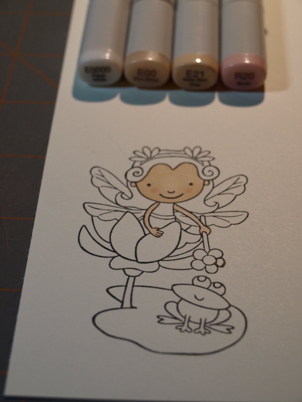
One of my first questions was, "Well, that is great, but how do I make the skin look like skin or the jeans look like jeans?" Like many of you, I wanted to be able to color basic images I had in my "stash" or ones I had traded with others.Today let's start with the skin tones. I had heard I needed E000, E00, E11, R20 (Blush) for skin, but how do I combine those to really make it look like skin? Could I do it? I was surprised the answer was yes. Let me show you what I learned!

First stamp your image on quality cardstock using a good ink like Memento Black Ink. I love the Bazzill cardstock at Cutter's Creek, and that is what I used. The stamp in this project is from Pink Cat Studios (Enchanted Lily Collection).

First you want to cover the entire area using your E000 or E0000. You don't have to worry about perfection, here. You are putting down your "base" coat. Work in small circles to get good coverage. Take your time, and get the feel of your pens.


Next we are going to add in E00. Again working in small circles. Choose where your light source will be, and leave those areas of the face lighter in your coloring. For my project, the light was coming straight on to Lily's face. I let her nose and forehead be slightly lighter than the rest of her face.


Next I added my facial shadows using E21. Around the hairline, the lower part of the face and ear area would all be the darker parts of the face. This is a a subtle variation in color. I lightly outlined the areas I wanted darker. Go sparingly. You can always return and add more color if you feel your shadows aren't quite right.

To give her cheeks a cute "glow", I reached for my R20. I made two small circles of blush area on her cheeks. I like this technique for cartoon type images.

Next I returned to my E00 to blend the colors together. Again, I kept the areas of the nose and center forehead lighter.

For her arms I used the E00 and the E21 for some shadow with the same technique.


Next time we are going to do the hair colors. I am going to cover the basic colors you will need for blond, brunette and auburn and black hair colors. I will be making Lily a blond, but you can do any hair color you choose.

Thanks for following along! I can't wait for the next installment!


Cutters Creek Products Used:

White Bazzill Cardstock
Copic Sketch Markers, E000 (or E0000), E00, E21 and R20
Memento Black Ink
Pink Cat Studios Stamps - Enchanted Lily


Monday, February 1, 2010

Welcome to Copic Mondays!


Welcome to Copic Mondays!!!!

Wow! This is going to be fun! Everything you ever wanted to know about Copic markers in one place!! When I first got involved in Copic markers, I had no idea where to turn to for instruction. There were online tutorials all over the place, but they were so difficult for me to understand, even though I’ve been stamping for almost 10 years. Every tutorial taught you a different technique, not what I really needed to know at this point, since I didn't even own a marker yet. I needed something that was easy – where to start and what I needed to begin using these markers called “Copics.”


Copics are alcohol-based markers. What does that mean??? These are permanent on lots of surfaces including paper, fabric (yes, fabric) and plastic, just to name a few. Copics have been around for about 25 years. How come stampers haven’t been using these for years? Almost seems as if someone in the stamping world just noticed them one day and figured they’d be a great medium to use with stamps!

My first question is why in the world would I spend around $6 for a marker? That’s almost the price of a package of cardstock, or a stamp for that matter! Well, for starters, there is the fact that they are permanent. The quality and lifetime guarantee is also a plus. The fact that they are refillable and I’ll never have to buy another marker might have been the deal breaker. But there was one other very important benefit.


I know it’s hard to tell from the above photo, but this Copic marker is being held straight, up and down, with the brush marker nib completely bent! Have you ever seen a marker that you could do that to without damaging it?


But what sold me on Copic markers was the ability to BLEND! Never before have I used a marker that could blend like this! Where was the paper pilling that I had been used to? Everything else that these markers could do was just an added benefit. It was at that point that I decided I needed these fun markers from Japan called Copics.


Okay, so you know what they do, but now you notice there are a few different choices of markers. Sketch, Ciao (pronounced “chow”), or the Original? Which ones do you get?

The Sketch, which has a flexible super brush end is a great feature, but runs about $6. It’s the most expensive, yet, the most popular marker that Copic makes. Then you have the Ciao, inexpensive, does pretty much the same thing as the Sketch, but you have to buy the extra brush nib (the end), and you can’t airbrush (oh yes, we’ll be getting to that at a later date). The original Copic, is double ended like the Sketch and Ciao, but is harder to find here in the US. They are used by the school children in Japan (hence, the reason the marker caps have holes in them, in case they are swallowed by the kiddos!).

My preference is the Sketch. Why? Well, to begin with, they now have 334 colors. “Wendy, do I really need 334 colors?” No, you really don’t. But when you get to blending, you’ll have more of a choice to pick from. I also consider the fact that these markers are going to be buried with me when I die, so I might as well splurge and get the ones I really wanted!! I also knew that I would want to airbrush with them at a later date since it was a feature. With the Copic airbrush kits (which we’ll hit on at a later date), you can airbrush your cards, scrapbook pages….(oh, I’m going to wow you with this one!), even your hair (here’s my disclaimer – this is not FDA approved and also not Copic approved), but it can be done.


There are also some other Copic markers out there. You have the Wide Copic, Multi-liners and Atyou Spicas. We’ll be getting to all these at a later date too.


Now that you have your markers, or at least a good idea of which you’d like to start working with, you’ll need cardstock. And not just any cardstock. There is a huge difference in cardstock. The cardstock I LOVE working with is Prism Simply Smooth cardstock, which you can find HERE. The cardstock is sold in packages of 25 sheets. I’ll get into why I love it so much a little later. One cardstock you will not want to use is Stampin’ Up! Cardstock. Don’t get me wrong…I love their products. But their cardstock has a special coating on it and could potentially harm your Copic markers. I don’t know about you, but I’m not using something that could potentially cause harm to my markers. This is directly from a Copic, themselves. Their website does need to be updated and they are aware of this.


Memento Ink. It’s as easy as that. You’ll need a fade-resistant dye ink. Memento is all that. You can find it HERE. Stamp your image, wait a few minutes for it to dry and you’re ready to start coloring.

If you want to color a digitally stamped image, you’ll want to make sure you hit it with your heat gun before coloring with Copics.


Well, this is where it gets fun. We’re going to be using Sketch Markers throughout Copic Mondays at Cutters Creek since they’re the most popular.

You’ll notice there are numbers on the Sketch Markers. You have 10 different color families (Blue, Blue Violet, Violet, Red Violet, Red, Yellow Red, Yellow, Yellow Green, Green, Blue Green). Then you have your Grays (Neutral Gray, Cool Gray, Warm Gray, Toner Gray), along with your Earth tones. There is also a Black and a Special Black. Keep in mind that there are 334 different colors! The above image is a “334 Color Wheel” that can be downloaded from the Copic website (you can find a copy http://copicmarker.com/wp-content/themes/copicmarker/PDF/updated_334_color_chart.pdf). I keep a copy of the Color Wheel in my Copic binder for reference.


Onto the Copic Color System. The numbers and letters on the markers represent the following:

First Letter = Family of Color (ie B = Blue, YG = Yellow Green)

Second Number = On a scale of 0-9, it shows how light or dark a color is. So you’ll notice in the markers above, the “2” in “B23” makes it a pretty light blue. The “5” in “E57” means it’s middle of the road brown.

Third Number = One a scale of 0 to 9, how much of the color contains Gray. So you’ll notice in the markers shown above, the “3” in “B23” has a low amount of gray, compared to the “7” in the “YG67” which has a mid-range of gray.

I hope this is as clear as mud!!!!

Now for questions…if you have any, please feel free to post them in the comment section. I will update and answer all questions you have regarding these awesome Copic markers!

Join us for the next Copic Monday installment on February 15th, when we’ll visit how to choose your colors, blending and lots, lots, more. Until then, we have some wonderful blog candy donated by Cutters Creek!! What do you have to do to be entered into this raffle for this amazing blog candy? Upload one of your Copic creations to the Cutters Creek Yahoo group by midnight EST February 14th. Not a member yet? It’s easy to join. Click HERE to join. And what will the winner receive? Upload as many photos as you like, however you will be entered only once in the random drawing. Ready for this? Three Copic Sketch Markers of your choice!! WOO HOO!! What else? A package of Prism Simply Smooth Cardstock!! Wow!! What a great way to start your collection, or add to it. And if you’ve never tried Prism Simply Smooth cardstock, you’re in for a big surprise!

I can’t wait to see everyone’s Copic creations!

~Wendy Petrie

Thursday, January 21, 2010

Angela's Warm Winter Wishes


Before moving onto Valentine's Day cards I decided to stamp one more Lily! I just love these stamps from Pink Cat Studios. The great thing about the Lily hot cocoa image is that she doesn't have to be used strictly for Christmas. And unfortunately, winter is going to be around for a little while so why not make the best out of it? I'm going to use this card as a thank you card, most likely.

I stamped Lily onto some of the new Prism cardstock (which I just LOVE) and colored her with Copic markers. I cut her out with a square Nestabilities die and then layered the image onto a scalloped square that I cut with another die. A card is not complete without a little sparkle right? I used twinkle jewels on the scalloped square corners, glossy accents on her mittens and boots, Stickles to make the fur on her hood stand out, and a Atyou Spica glitter pen on her hot cocoa mug! I finished it off with a border punch and some patterned paper from my stash.

If you have any questions for Angela about this fun card project just ask! She or another member of the Design Team will be happy to answer.

Angela's Warm Winter Wishes was created using the following products:
These products can be purchased from Cutters Creek!
Related Posts with Thumbnails