Showing posts with label Ranger Distress Crackle Paint. Show all posts

Sunday, March 10, 2013

Altered mini frame by Ms. Pebbles

Hello everyone! The last project I did (Altered Nesting Boxes), I used some Distress Crackle paint and I really like how it turned out. So I decided to give it a try on mini frame that I have had sitting in my craft room for a couple of years now that I purchased from the dollar store!


This 3x5 frame started with a silver, shiny almost chrome like finish on it. I applied a coat of white Gesso first to prep it for the acrylic paint and let it dry completely. Then I painted a coat of pink acrylic paint over the entire frame and allowed it to dry. Now comes the fun part! I painted the frame with Distress Crackle paint and set it aside to dry. Waiting for it to dry was the hardest part! :) I really love how this turned out! The pink barely showing through the cracks really makes it pop! Then to embellish it, I just grabbed a flower from my stash and stick pin to match and hot glued them in place.
Thanks for looking! :)

Saturday, March 2, 2013

Altered Nesting Boxes by Ms. Pebbles

Happy National Craft Month!!! I've decided to alter some nesting wooden boxes. This project was fun and easier than ever!
The hardest thing about altering these cute boxes was decided whether to go with paint or paper to cover them...
So I did a combination of both! By using a coordinating paper pack from My Mind's Eye, all I had to do was use a coordinating paint and decided to go with Distress Crackle paint.
For the large box I used all paper to cover it. I inked the edges with Distress Ink Tea Dye and this is the only box top that I used a dimensional embellishment because the other tops would not be able to nest if they weren't flat embellishments.
On the medium box, I used the combination of covering 2 of the sides and the lid with Gesso and then Distress Crackle paint. I love the shabby chic look of crackle paint!
The smallest box I used all paper again, but this time I used the same pattern on all 4 sides and inked the edges with Distress Ink Tea Dye. I also used a piece of the pattern paper to cover the top and just used Stickles to embellish it!

Here's a list of products you can use to alter some boxes:

My Mind's Eye
Distress Crackle paint
Distress Ink
Stickles
Gems


Sunday, August 26, 2012

Altered Halloween Treat Box


Today I have for you a fun Halloween Treat Box. I picked up this wooden coffin at my local box store and spray painted the whole thing black. I cut some paper to fit the inside of the lid and bottom of the box and used some Glue and Seal to attach and seal the paper on the inside of the coffin . I cut the word Beware from the Happy Haunting cartridge at 1 1/2" and attached it to the inside lid. I  then painted it with some Rock Candy Crackle Paint which gave it an aged look inside.


On the outside I cut some images from the Happy Haunting Cricut Cartridge and glued them to the outside of my box. I then sprayed the entire outside of the box with the Iridescent Glitter Dust. I think  you can see the sparkle in the photo.

Friday, June 1, 2012

Father's Day Blog Hop

Welcome to the Cutters Creek Design Team Fathers Day Blog Hop! We want you to hop along with us and play for the Grand Prize The objective for our Blog Hop this weekend is to inspire you to create something beautiful for all of the "Fathers" in your life! We have a bit of everything, from cards to gift ideas to layouts about our fathers!


Take an old pink and white frame, a bit of paint, and Graphic 45 paper and turn it into a Father’s Day gift. The first bit of transformation was painting the whole frame with black acrylic paint and then slathering it with Vintage Photo Distress Crackle Paint. Once it dries and cracks, rub some Black Soot Distress ink into the cracks and rub off the excess with a soft cloth. Next take your chipboard letters and glue them to Graphic 45 paper. These used two sheets from the Olde Curiosity Shoppe pads and some Aleene’s Quick Dry Tacky Glue. Once they were dry I inked the edges using Gathered Twigs for the word Pappy and Peacock Feathers for the We and U, and I used Glossy Accents to add some shine to the bottom letters.

I then chose a coordinating cardstock (also from the Olde Curiosity Shoppe set) and covered the mat. I used Scor-Tape to adhere it to the backside. To add a bit more depth I stuck a piece of Inkssentials Foil tape sheets to a remnant piece of cardstock and cut it with Tim Holtz’s On the Edge Steampunk.  I used several different alcohol inks to age it and then glued to the mat with Glossy Accents. Next I took one of the Kaisercraft Wood Flourishes (hearts) and covered it with Ruby Diamond Range Flower Soft using the Flower Soft Glue.

While everything was drying, I punched a few butterflies out of leftover foil tape and Graphic 45 papers, layered them and glued them around the mat. I used mini glue dots to hold Pappy angled from the frame to the mat, Glue Dots pop dots for the letter w, and on everything else I used glossy accents again.  I needed one more embellie and turned to my Tim Holtz tickets and his stick pins, colored them with all three of the new Distress Inks (Peacock Feathers, Shaded Lilac, and Squeezed Lemonade—these are absolutely gorgeous colors!), and pushed it into the mat.

Now for the details about the Grand Prize I mentioned at the beginning of my post. Check it out! What an awesome prize don't you think???


To qualify you must leave a comment at every stop along the way. Comments should be made by Midnight, June 3rd. We will use Random.org to select a winner so be sure to check back with us on Monday to find out if you have won!

Don't forget to leave a comment here before you hop along to  Kim's Blog! Thanks for hopping by!

Friday, May 4, 2012

Glimmer Mist Background by Chris


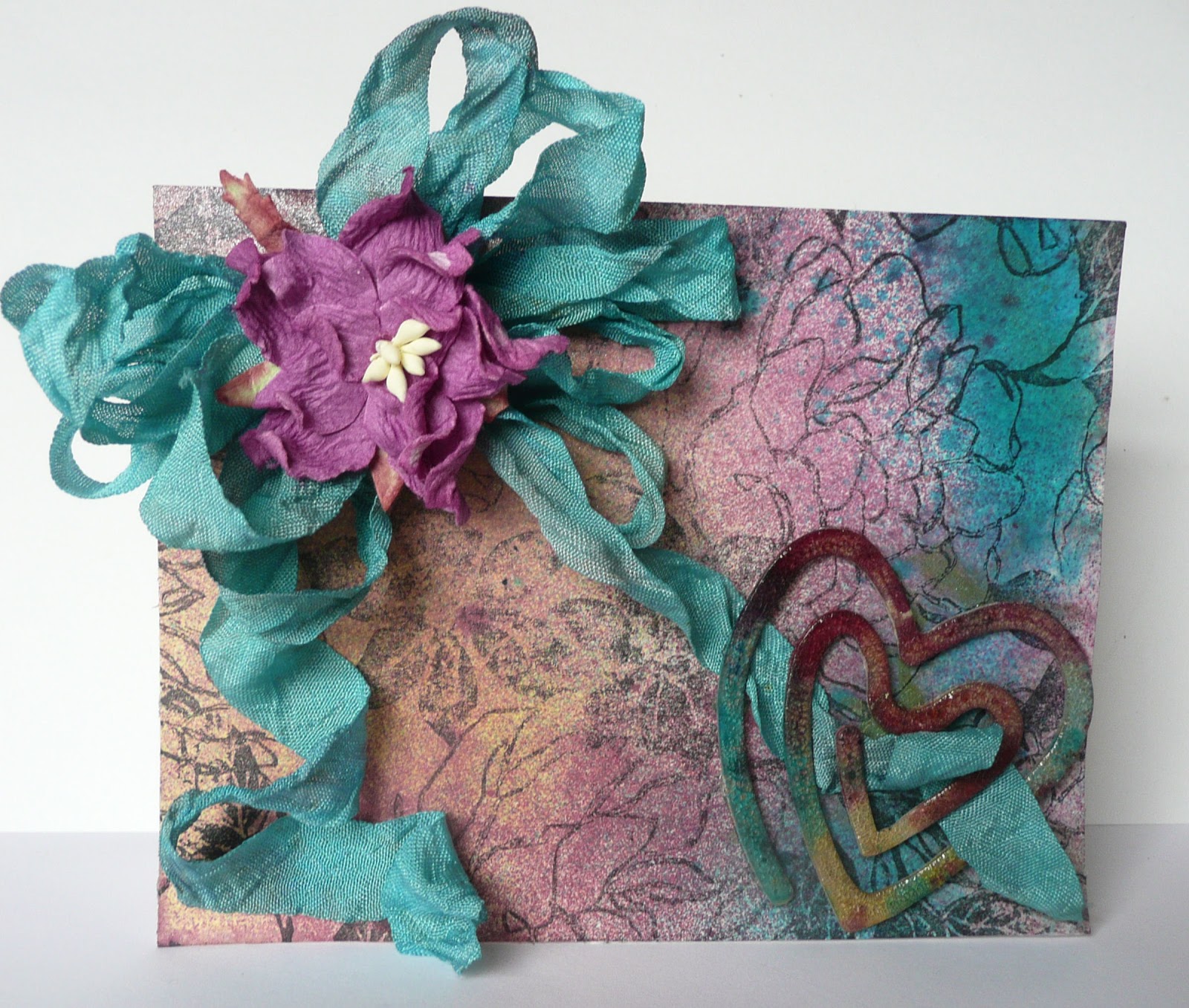
The background was done on a 4.25 x 5.5 inch piece of cardstock. I pooled several different colors of Tattered Angels (Electric Blue, Pomegranate, Dragonfly, Sun Sisters) on the cardstock—no soft sweeping here--and used my heat gun to dry them. Once the background was dried, I stamped the image using Staz-On ink and used my ATG to adhere it to the card base. I then cut a length of white seam tape and dyed it to match the card with Electric Blue Tattered Angels Glimmer Mist. A multi-loop bow with a Cutter’s Creek Flower glued in its center was adhered to the card base using Glue Dots. The embellishment is a Sizzix die cut with my Big Shot, slathered with Rock Candy Distress Crackle Paint and set aside to dry. Once it was dried and crackled, I used the same Tattered Angels Glimmer Mists to color the heart. (This Technique called Shattered Stains. It is in T. Holtz’s second compendium, page 48, if you’d like the specifics.) I wove one ribbon tail through the heart and used mini Glue Dots to loop both tails in place, added a sentiment inside, and my mother’s card is done.

Friday, March 30, 2012

Mandie's "Discover" Card

I've always been fascinated with quilting. I love the look and the texture but... I don't sew. I'm not that patient, and it's harder to "embellish" mistakes on a quilt. I can't just pop a cute flower over it! So, I decided to make a quilt with paper. I was flipping through an outdated AAA Travel Guide and I was looking at all of the beautiful photos and thought, "These would make a beautiful paper quilt!" so I grabbed my trimmer and started cutting.


I took a handful of photos that I liked and cut them into 1/2" strips. Then I started playing. I arranged them so my floral elements were on one side and my mountain/rock elements were on the other. I just loved the little fish so he became my center point. I adhered my strips into a log cabin pattern and thought it needed something more. So I pulled out my Tim Holtz Rock Candy Crackle Paint. This stuff is AMAZING! You get a beautiful fine crackle and it dries pretty fast if you do a thin coat. After painting it on with the attached to the lid brush and letting it dry I decided to add a little more depth to the cracks so I added a little bit of Walnut Stain Distress Ink.


I wanted my background to have the same organic feel as my photos so I used more Distress Ink in Ripe Persimmon (from the LE Fall collection) and Peeled Paint. Then I splashed some water on it, using some big drops and small ones to get the effect you see. Then I added some corduroy ribbon with some Scor Tape and a few brads and finally added the "Discover" with my label maker. Finally, I used some Foam Adhesive to pop up all my layers.

Tuesday, January 31, 2012

Mandie's Keepsakes Box

When I started this project it was going to be a quick and pretty little box. I had a very simple idea in my head for what I wanted to do... and then I found myself adding a little more here and doing a bit more there, and found myself spending many hours creating this little box.

It started lift and a plain wooden "book-look" box that I had purchased a couple years ago, on clearance for $.29. I had purchased several because they were so cheap and cute. Fast forward to a few weeks ago and I decided to FINALLY alter one of them.

To begin, I sprayed the "Pages" part with lots of Glimmer Mist. I started with the Walnut Gold, added some Coffee Shop and then finally some Tattered Leather. Then I used my Black Adirondack Acrylic Paint Dabber to paint the rest of the outside of the book. Then I decided to work on the inside of the book first.


I started with some fabric remnants that I picked up at a local craft store. I loved the silky patterned one so I simply used my Scor Tape and adhered it to a sheet of chipboard that I cut slightly smaller than the inside measurements (to allot for the fabric's bulk). Then I used my Glossy Accents to adhere this piece to the inside bottom of my box. Did you know that Glossy Accents is an excellent adhesive as well? I then repeated this to line the inside of my lid. Next a grabbed the music note fabric and cut small pieces of chipboard to do all of the inside sides on the box. Since the music note fabric was plain white cotton I wanted to make it co-ordinate just a bit more. So, I grabbed my Bazzill Splat Mat, my Heat Tool, a Mini Mister filled with water and my Glimmer Mists! First I sprayed the ribbon with water to make the dyes soak in better. Then I randomly sprayed Mel's Diner, Wheat Beer and Meadow Green all over my fabric. I used my Heat Tool to dry it and then cut it to cover my chipboard and used more Scor Tape to adhere it. Then used the Glossy Accents to attach all the pieces to the sides. I also used some giant binder clips to make sure my pieces stayed tight to the surface to dry.


Next I started working on my cover. Remember the Mosaic card I posted here a few days ago? Well, this is the original project that I had cut all those pieces for. I just cut strips from my Echo Park Paper "For the Record" 6 x 6 Paper Pad. This technique would really be great with any of Echo Parks lines! Then I inked all the edges of my pieces by swiping them over my Walnut Stain Distress Ink Pad. Then I very sparingly added Glossy Accents to the back of each piece as I created my pattern. I made sure to leave space for my title piece. Then I used my Glossy Accents to cover each piece of paper to give it a glass tile look and let it dry.


For my title, I had picked up these really cute "mistables" at a LSS a while ago and they've been sitting on my desk waiting for just the right project. I think this qualifies. So I used my Wheat Beer Glimmer Mist to cover the whole thing. Then I used my Barn Door and Walnut Stain Distress Inks around the edges. Then I added a layer of the Rock Candy Distress Crackle Paint. When it was dry I added more Walnut Stain Distress Ink to the cracks (just liberally apply it with your Ink Blending Tool and then use a damp cloth to wipe off the top). Then I added 2 layers of chipboard behind it to raise it up a bit more. After I adhered it to my box with more Glossy Accents I then added the Glossy Accents to the top of this as well.


So here is where I will mention what I will call my "Glossy Accident"... I had actually already completed most of my box when I was adding that final title "tile". When I set it aside to dry I didn't realize that it was sitting at the tiniest angle... and when I came back to it to take photos I gasped. The Glossy Accents had slowly traveled over the edge of my tile, through the other tiles and down the side of my box. Well, I'd invested too much time in this box to toss it aside and start again, so I decided to roll with it and disguise it as much as I can! So I added Glossy Accents to the whole top of the box. First I very carefully outlined the whole top of the box with it and let the outline dry on a completely level surface (yes, I checked it with a level to be certain). Then I filled in the rest of the "grout" space with a thin coat. When that was dry I added one more layer to all of my tiles to be sure they all stood out. I love the finished effect!


Ok, so now I will tell you how I decorated the back of my book box. I wanted it to sit flat so I needed a flat design. I created a stencil from one of the shapes in one the For the Record papers. Then I used my White Adirondack Paint Dabber to fill in my shape. When it was dry I removed the mask and then I randomly added my Glimmer Mist using the Wheat Beer, Coffee Shop, Walnut Gold and Tattered Leather to it. Then I painted the Rock Candy Distress Crackle Paint over the area and when that was dry I added Scor Tape around the edges, peeled off the backing and covered it with antique gold glitter. A quick simple way to make sure your glitter goes on perfectly straight!

Here's a look at the spine of the book. I simply added my paper (this was a 12 x 12 sheet from the same line) and added some May Arts Velvet Ric Rac to the edges. After that previously mentioned "Glossy Accident" I added the Rock Candy Distress Crackle Paint over the top as well to mask that little boo-boo.

I's so thrilled with how my little book box turned out, now I just need to find some special treasures to tuck inside!

If you Like it, Pin It!

Tuesday, November 22, 2011

Mandie's Tim Holtz Inspired Tags

I will admit, I look forward to seeing what Tim Holtz comes up with each year for the Tags of Christmas Past. So this year, before he begins, I decided to review some of the previous years tags for some inspiration and here are a few of the tags I came up with (please excuse the iPhone photos)


For this first tag I used Walnut Nut Stain, Frayed Burlap and Gathered Twigs Distress Inks. I used the direct to paper method and just kept adding ink, strait from the pad onto the paper, until I was happy. Then I stamped my deer onto Kraft Cardstock and cut it out. I coated it with my Rock Candy Crackle Paint for a bit of bling. Finally I tore some strips of natural denim and stamped the music notes. I stuck them down with some Scor Tape and attached the deer with some foam adhesive. I added a cool strip of fabric (from the remnants section at a fabric store) to the top and called it done!

For my "Autumn Splendor" tag, I used Festive Berries, Ripe Persimmon and Peeled Paint Distress Inks with my Blending Tool to create the background. Then I used a set of leaf stamps and stamped my images with Distress Inks. On a piece of scrap cardstock I stamped "Autumn Splendor" with Embossing Ink and embossed it with Gold Embossing Powder and my Heat Tool. Then I blended a bit of ink over to top of it. I attached my phrase with some foam adhesive ad added an acrylic acorn.


For this tag I used only my Winter Seasonal Distress Inks for color. I added the Festive Berries and Evergreen Bough to the background. Then I spritzed it all over with my Mini Mister and crumpled the tag. I dried it a bit with my Heat Tool while it was still crumpled up and then carefully smoothed it a little. I used the Iced Spruce and ran it over the top of the tag, catching the raised wrinkles. Then I used my hands to smooth it a bit more. On some scrap paper I stamped my Santa and my "Merry Christmas". I inked Santa with the Evergreen Bough and then coated him with the Rock Candy Crackle Paint. When he dried, I added the Festive Berries to the rest of the piece. I tore it out and then matted it on a piece of torn Kraft Cardstock. I also inked my Merry Christmas with the Festive Berries and Iced Spruce. Then I attached both pieces with foam adhesive. I inked up my piece of mesh ribbon with Festive Berries too!

My last tag is my favorite. I used Broken China, Evergreen Bough and Seedless Preserves to ink up my background. Using the same colors, I stamped snowflakes all over the background. Then I used some Stickles and smeared them across the background with my finger for a bit of sparkle. I stamped my deer with Evergreen Bough, coated it with Rock Candy Crackle Paint and fussy cut it and attached it with foam adhesive. I had the "Season's Greetings" epoxy sticker in my stash and added some tinsel ribbon.

For clean up when you are done playing with your inks, I HIGHLY recommend the Inkssentials Craft Scrubbie! It get all of that ink off of your fingers!

Thursday, August 25, 2011

Summer Memories by Laura C

Yep, summer is nearly history.....but I've got a great idea for
remembering the fun! The above is the finished result of a
project that started here:

Yes, a silly sign I got in the clearance aisle for $2 at Target!
Do you just pass this stuff by? Who would have thought
that was where this project started?.....lol!!

It really started with the yummy Graphic 45 12x12 paper
On The Boardwalk collection, and I traced the shape of
the sign onto the blue swirl paper and adhered that to the
front of the sign with Scor Tape. I sanded down the edges
to get a good fit, and give it a beachy feel.

Next I took this printed paper from the collection, and
distressed it.....you can see the "before and after" here:

I sanded the edges AND the actual paper, then used Vintage Photo
Distress Ink....it makes it look wispy and sand-washed.

Then for the Flower Soft fun! I got out my Bazzill Splat Mat,
used the Flower Soft wires, glue,and Flower Soft Ultra Fine
Sage color. I dipped the wires in the glue, then rolled them
in the Flower Soft. You can see the result here:

I let them dry really well (about an hour) and then I shaped them
into the beach grass you can see in the close up here:

The sandy beach is kraft cardstock torn and inked with the
Vintage Photo Distress Ink, and I also used a sandy type
embossing powder from my stash.

The beach sign is cut from the Graphic 45 papers,
distressed, and then inked up with Vintage Photo ink.
I applied Rock Candy Distress Crackle Paint and
after it dried, used more ink to hi-light the cracks.
If you look closely at the sign post in the above
pic, I used a small piece of white cardstock, scored
it lightly, then inked it with the Vintage Photo. It
looks just like a piece of weathered beach wood,
don't you think? Two small brads fasten the sign.

Finishing touches....a pic of my guys at the beach, a few
of the actual shells we collected, some pretty bling from
Want2Scrap, a bit of gauzy ribbon and twine, and it's
a finished project:

A beautiful memento of our beach vacation.....it's a gift
for my MIL, because they go with us every year!
Shhhh, don't tell.....it's a secret!!

Hope you enjoyed this project!! Remember to think
outside the box when you see those goodies on
clearance in the store, they could be your latest
and greatest project, especially when they are
topped off with goodies from Cutter's Creek!!

Available at Cutter's Creek:
Graphic 45 12x12 paper (On The Boardwalk)
Scor Tape
Distress Ink (Vintage Photo)
Distress Crackle Paint (Rock Candy)
Flower Soft (Ultra Fine Sage)
Flower Soft Wires
Flower Soft Glue
Bazzill Splat Mat
Want2Scrap Rhinestones


Monday, August 8, 2011

Chris’ Altered Box

An altered box is so easy to make when you have quality paper like Graphic 45. For this box I used Curtain Call and a couple of sheets from A Proper Gentleman. Inside I just measured and cut strips and glued them down with my Scor Tape. On the inside top lid I added a flower made from 3 circles of the same paper (2.5, 2, and 1.5 inches) and punched a hole in the centers. I distressed the edges with my Zutter Distrezz-It-All, sprinkled the circles with water, crumpled them and pushed a brad through it when dry. I then rubbed some Tattered Rose and some Antique Bronze Distress Stickles over the petals and set aside to dry.


The brads around the lid are actually half of a silver ribbon that I cut in half length-wise and colored with Copic Y28 Lionet Gold. This too was attached with Scor Tape (gotta love that stuff!). I then painted the lid of the box with Antique Linen Crackle Paint. (I did not use Gesso first because I wanted it to peel and show some of the gold print underneath--.) When it was dry I rubbed a bit of Black Soot Distress Ink into the cracks. Cutting out some more Graphic 45 paper I mounted them on slightly larger rectangles (from the Gentleman Collection), dampened the edges with my fingers and torn and folded/twisted the paper to make distressed frames.


To make the corner flower I cut up a used dryer sheet, sprayed it with Glimmer Mist in Sun Sisters and Santa Baby and a homemade brownish one using Distressed Walnut ink and some bronze mica powders. These were joined with a button and edged with Tattered Rose and Antique Bronze Distressed stickles. The two goldish-colored roses were made using SCAL and PDC’s cut file.


The sentiment I created on my computer and cut and embossed with the Cuttlebug Embossing Plus Fanciful Labels and Black Soot Ink. To age all the pictures and the label I smeared them with Rock Candy Crackle Paint and let them dry. Everything was adhered with Scor Tape. I then added Tim Holtz’s Ideology Film Strip Ribbon. This was tricky to curl where I wanted, but with a bit of patience and some Glossy Accents I got it to stick.


My husband is lovin’ it and has his jewelry stashed inside. What do you think?
Related Posts with Thumbnails