Showing posts with label Embossing. Show all posts

Saturday, June 1, 2013

You're the King - Masculine Card with Lori

It's my turn today to share a masculine card with you.  This one is perfect for the King of your castle, for Father's Day, birthday, anniversary, or just because.


Neutrals or dark colors are perfect for masculine cards, and a pop of color makes them eye-catching. My papers are from Graphic 45's Kraft Reflections paper pad. This is no longer in stock at Cutters Creek, but any of the other paper pads with darker colors would be great! (Basically anything currently in the store except Secret Garden.)


Texture is also a must for masculine cards, because we tend to stick to simpler patterns for them.  I used my faux leather technique and a Tim Holtz buckle to create this "belt" on my card. I added a pop of color by making this "poker chip" using a stamp from my stash and embossing with red embossing powder on red cardstock. I made sure the tones were slightly different so it would still "read" well.


Finally, I added my sentiment, using words from two different stamp sets (you're & the) and an alphabet set (king).

Supplies available at Cutters Creek:
Other supplies:
  • cardstock
  • clear embossing ink
  • red embossing powder
  • sentiment stamps
  • Tim Holtz buckles
I hope I gave you some new ideas for your masculine cards today. Thanks for stopping by!

Wednesday, May 2, 2012

Krafty Card for Baby with Lori

So, I've been seeing a lot of all-white cards on Pinterest lately.  Super cute, but of course I feel the need to be different... plus, I needed a baby shower card and I wanted a bit of a vintage feel.  I also wanted to add just a bit of color to the monochromatic base.  So... ta-da!


This is a pretty easy technique to do - the trick is just finding embossing folder patterns that work well together.  You can usually do pretty well by choosing one large-size pattern, one medium pattern, and one small pattern.  Also, try to keep the styles similar - I went traditional, but you could also go all modern or all grungy (think Tim Holtz folders).

Every embossed pattern here is a separate piece of cardstock, layered up.  My focal image is also popped up using foam adhesive tape for added dimension.

I used a variety of border punches to stack "eyelet" borders along the bottom of the card.  At the top of the stack, I added pale pink ribbon and a bow trimmed with my I-magicut ribbon cutter.

Here's a list of the supplies I used to make this card:


Cutters Creek
Other
  • Close To My Heart kraft cardstock
  • Close To My Heart Baby Pink cardstock
  • Close To My Heart Mocha Opaques adhesive pearls
  • Cricut machine and Mother's Day LE mini
  • pink ribbon to match CS
  • Fiskars border punches, Diamond and Effervescence
  • Fiskars embossing border punch, Scalloped Daisy
  • Sizzix/Basic Grey embossing folder, Santa Baby
 That's it for today - thanks for stopping by!

Monday, March 12, 2012

Nestabilities and MME Paper by Chris


Once again I turned to my Spellbinders Nestabilities and threw some My Mind’s Eye paper into the mix. Using the largest of the Petite Scallops dies I cut two circles from some black cardstock. I mounted a sentiment (printed on my computer) on one and set it aside for the inside of my card. For the front piece I layered 3 Spellbinders Nestabilities Classic Small Circles using two sheets of MME Lost and Found 2 Sunshine Pack and another piece of black cardstock. I also fussy-cut out the text box with the flower from the Sunshine Pack. 


Before layering all the pieces, I used my embossing pen to trace along the edges of the front pieces scallops and embossed with Superfine Gold Embossing Powder. I also embossed the sentiment using Superfine Black Embossing Powder and a stamp I had in my stash. I used my ATG to layer the circles and the text box. (I did a bit of trimming of the text box on the left side so it curved along the largest circle.) I wanted a bow and only had some white ribbon. CopicY28 to the rescue, as I colored the ribbon, let it dry and then tied a tiny bow, which I attached with a micro Glue Dot. I wanted the flower from the text box to stand out a bit more, so I took out my Sakura Glaze Pens and colored over the oranges, yellows, and blacks of the flower. To put it all together, I scored across the top ¼ inch of the back piece and matched up the scallops, and used my zig pen to glue the two pieces together.

Tuesday, November 22, 2011

Mandie's Tim Holtz Inspired Tags

I will admit, I look forward to seeing what Tim Holtz comes up with each year for the Tags of Christmas Past. So this year, before he begins, I decided to review some of the previous years tags for some inspiration and here are a few of the tags I came up with (please excuse the iPhone photos)


For this first tag I used Walnut Nut Stain, Frayed Burlap and Gathered Twigs Distress Inks. I used the direct to paper method and just kept adding ink, strait from the pad onto the paper, until I was happy. Then I stamped my deer onto Kraft Cardstock and cut it out. I coated it with my Rock Candy Crackle Paint for a bit of bling. Finally I tore some strips of natural denim and stamped the music notes. I stuck them down with some Scor Tape and attached the deer with some foam adhesive. I added a cool strip of fabric (from the remnants section at a fabric store) to the top and called it done!

For my "Autumn Splendor" tag, I used Festive Berries, Ripe Persimmon and Peeled Paint Distress Inks with my Blending Tool to create the background. Then I used a set of leaf stamps and stamped my images with Distress Inks. On a piece of scrap cardstock I stamped "Autumn Splendor" with Embossing Ink and embossed it with Gold Embossing Powder and my Heat Tool. Then I blended a bit of ink over to top of it. I attached my phrase with some foam adhesive ad added an acrylic acorn.


For this tag I used only my Winter Seasonal Distress Inks for color. I added the Festive Berries and Evergreen Bough to the background. Then I spritzed it all over with my Mini Mister and crumpled the tag. I dried it a bit with my Heat Tool while it was still crumpled up and then carefully smoothed it a little. I used the Iced Spruce and ran it over the top of the tag, catching the raised wrinkles. Then I used my hands to smooth it a bit more. On some scrap paper I stamped my Santa and my "Merry Christmas". I inked Santa with the Evergreen Bough and then coated him with the Rock Candy Crackle Paint. When he dried, I added the Festive Berries to the rest of the piece. I tore it out and then matted it on a piece of torn Kraft Cardstock. I also inked my Merry Christmas with the Festive Berries and Iced Spruce. Then I attached both pieces with foam adhesive. I inked up my piece of mesh ribbon with Festive Berries too!

My last tag is my favorite. I used Broken China, Evergreen Bough and Seedless Preserves to ink up my background. Using the same colors, I stamped snowflakes all over the background. Then I used some Stickles and smeared them across the background with my finger for a bit of sparkle. I stamped my deer with Evergreen Bough, coated it with Rock Candy Crackle Paint and fussy cut it and attached it with foam adhesive. I had the "Season's Greetings" epoxy sticker in my stash and added some tinsel ribbon.

For clean up when you are done playing with your inks, I HIGHLY recommend the Inkssentials Craft Scrubbie! It get all of that ink off of your fingers!

Monday, November 21, 2011

A Beautiful Autumn Card by Chris

I am still working on ways to use and reuse many of my cool items from Kim. One that kept looking at was the Cuttlebug Owl Flourish Embossing Folder, which I just didn’t want to do as an embossed card front again and I wanted to try out a new technique I learned, but what to do, to merge them?

I started with a center step card. The base was 11 by 5.5 inches and I had some cute paper that looks like tree bark. I decided to use my Scor-Pal and I cut both sides one inch in from the edges and from 1-inch mark to about 6.5 inches. Both sides were then scored between the cut line and the edge at 1 inch (mountain), 2 inch (valley), and 6.5 inches (mountain) and the center piece was scored at 5.5 inches (mountain). I then folded them to make my card shape.

Link
I used my Cricut cartridge Stretch Your Imagination (check with Kim if she can get you this one) and cut the squirrel and nuts with the shift key at 4 inches. I made a shadow piece and using Pop Up Dots raised the acorns up slightly. I used my ATG to glue it down to one of the side steps. I then took my Owl Flourish and embossed some Core’dinations Cardstock, sandpapered the raised image, and fussy cut the owl and flourish out of the paper. I glued this right along the top of the lower fold in the center and added some Cinnamon Stickles for the eyes. I then cut the word "Autumn" from the Stretch Your Imagination cart at 5 inches and rubbed the edges with some Walnut Stain Distress Ink. The shadow is cut from Chestnut American Crafts Glitter Cardstock. I did a multi-cut of 2 to get this out and inked the cut edges with Walnut Stain. I used my Zig Glue Pen to attach the word to the shadow and then pop dotted the shadow up along the base.
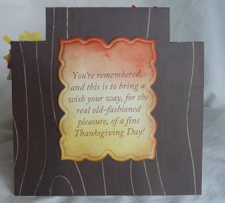

The card needed a sentiment and I decided to use my Spellbinders Labels Twenty Three, printed the sentiment with my computer and inked the edges with Vintage Photo, Mustard Seed, and Ripe Persimmon Distress Inks and glued it to the back of the card.


The card still needed some pizzazz. Taking a fall leaf stamp, a Clear Tim Holtz Distress Ink Pad, my Embossing Magic pad, and some white embossing powder I stamped and embossed the image several times on cream cardstock. I then used several of my Distress Inks (Dried Marigold, Mustard Seed, the Limited Edition of the Fall Colors, Walnut Stain, Spiced Marmalade, and Crushed Olive) and applied them directly to the paper smearing them alongside of each other over the leaves. Then I took my Tattered Angels Dazzling Diamonds and sprayed the heck out of each of the leaves. It looks a mess but be patient. Set them aside and let them dry—totally dry, no rushing. You get a blended, shiny and crisp texture to the cardstock when it dries. (It works terrifically on watercolor paper too.) When the leaves were totally dry, I fussy cut them out and used pop dots to arrange them on the card. I do so hope you can see the shine in the pictures, but if not—take my word for it, it’s great!

I’m thinking that this might look lovely as part of a table centerpiece rather than mailing it out. What do you think?

Wednesday, September 28, 2011

Chris' Echo Park Halloween


I started with an image I’ve had for a while and the idea that I wanted to practice brayering some more (is that even a verb?). The image is stamped with Memento Tuxedo Black, cut using Spellbinders Nestabilities’ Small Deckled Rectangles, and then colored with Copics (YR07, YR18, YR68, YR14, G94, C5, and Y06). Next I embossed the image using clear embossing powder, my Inkessentials Embossing Pen, and my heat tool. Once that was cooled, I inked my brayer with Wild Honey Distress Ink and rolled from the bottom right diagonally across the image. Inked my brayer again this time with some Spiced Marmalade and lightly went over the corner and partially into the image. I then turned the image around and did the same thing starting with Stormy Sky Distress Ink followed by Black Soot. I then spritzed some water into the air and waved the image card through the mist. I love how this helps blend the inks. I wiped off excess ink using a paper towel and set aside.

My card base is all built using Echo Park Papers from the Apothecary Emporium Collect ion Kit. I cut a one inch strip of Wicked Potions and a 3.25 block of Full Moon and attached them using my ATG gun. I cut 2 flourish brackets from Spellbinders Shapeabilities Parisian Accents from Wicked Potions and 2 graduated sizes of the Spellbinders Nestabilities Labels Twenty-Three from the backside of Full Moon. All edges were inked with Wild Honey and Black Soot Distress Inks. I layered these on the front of the card and used pop-ups on the two top layers. It still needed something…so out came my I-Rocks and added a few gems around the brackets and the corners of the second label layer. Still not quite happy with the results, I added a Happy Halloween ribbon swatch to cover the seam of the two papers and then wrapped some fibers from my stash along the top. Finally I inked the inside and used a frame and letters from the Apothecary Kit to finish the card.

Now to get started on the rest of my Halloween cards—it’s a big celebration in our house because it is my DH’s birthday and we always tease him that the holiday started when he was born!

Saturday, August 6, 2011

Congrats by Melissa

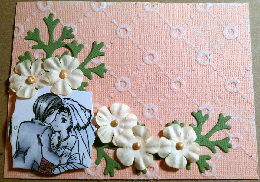
So I made a really simple congrats card for a bride and groom.  The total card size is 3 1/2x 4 1/2.  So it's great to slip in with a gift.  

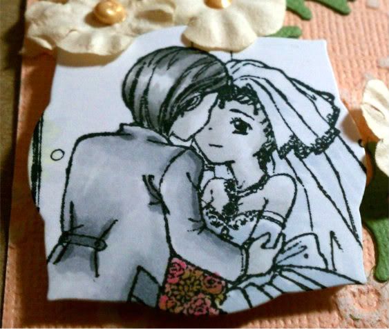
I started coloring this adorable image from InStyle Stamps; the Wedding Couple.  I colored in all grays to make it classic looking.  Once done, I used my Labels Three to cut out the area around their faces.  


I sanded my base paper which came from the Cosmo Cricket Core'dinations pack.  I than used my Big Shot again on leaves from the Foliage set.  I used some paper flowers from my stash and used some Gold Liquid Pearls for added effect.

What do you think?

thanks for looking!!

Paper: Bazzill Simply SmoothCore'dinations
Ink: Memento Tuxedo BlackCopics,
Embellishments: Liquid Pearls
Other: ATG, Glue PenSpellbinders: Foliage and Labels ThreeBig Shot
Stash: Kaisercraft paper flowers: cream

Groom Hair: T1, T3, T4, T6
Skin: T0, T1
Dress: C1, C2
Veil: C00, C1
Flowers: R83, R85, E04, YG91, YG93, YG95

Saturday, July 30, 2011

Melissa's Christmas in July


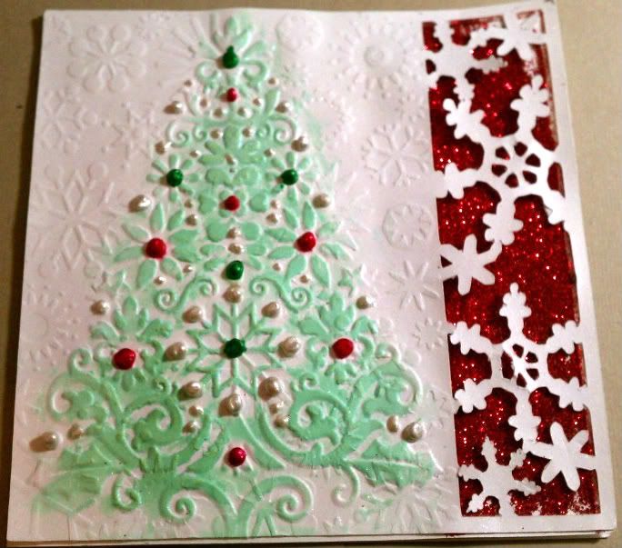
So I decided to revamp a Christmas card idea I have had for quite awhile.  I started with a snowflake border on my computer for a 5x5 card and cut it out using my Cricut.

After I cut the image, I ran the paper through my Big Shot with the Cuttlebug Snowflakes folder and again with my Lace Tree folder to soften the snowflake impressions slightly.

I used some red glitter from my stash to bring out the snowflake design.  I wouldn't recommend glitter for an area this large as it gets messy!  For future cards, I will use the American Crafts glitter card-stock.  It cuts cleanly and there is no glitter residue to be found weeks later on another project :o)

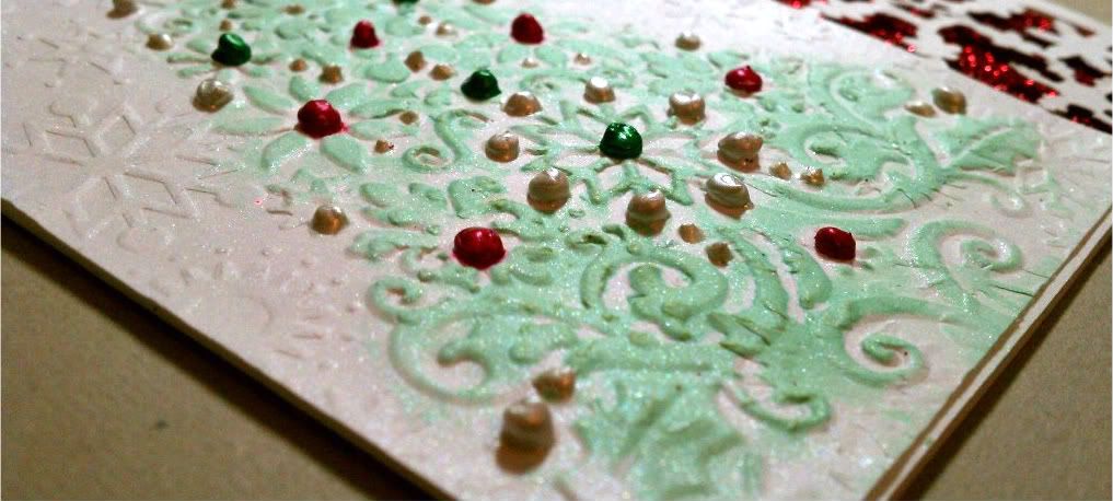
After the glitter was added I glued my embossed/cut image to the card.  It was still missing something, so I sprayed some Lily Pad glimmer mist on a tissue and ran the tissue over the raised image of my tree.  Once it was dry, I sprayed the front of the card with Dazzling Diamonds glimmer mist to add overall shimmer.  Doesn't it look pretty?


For the next step, make sure your card is completely dry!  I didn't check and noticed after the fact and had some ink running.  I used 3 different Perfect Pearls to accent "ornaments" on the tree.  What do you think??  Definitely a lot of work for a Christmas card, but you are waiting for the card to dry so much in between that it is actually pretty easy to reproduce like a production line.

thanks for looking!

Image: n/a 
Paper: Bazzill Simply Smooth 
Ink: Glimmer Mist: Lily Pad, Dazzling Diamonds
Embellishments: Perfect Pearls: Emerald Green, Ruby RedWhite Opal
Other: ATG, Big Shot, Cuttlebug -Lace Tree (retired), SnowflakesCricut
Stash: red glitter

Monday, July 25, 2011

Melissa's Summer Cards

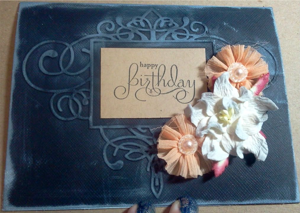
 So I was looking through my Color Inspiration Magazine that came out earlier this year and I got an idea.  Not so much the colors but the layout.  If you have it, it's on page 46 - Spread Sunshine.  I just love this simplicity of it, so here are some simple birthday cards I came up with.


I really like the look of white ink on black paper, so I wanted the white to look a little messy on the embossed images.  The first card I used Flourished Frame and added the white ink and flowers after stamping my words on some Kraft paper from my scrap paper.  Who says brown and black don't go together :o)  I topped it with someCuttersCreek branded and Prima flowers.


This card I also embossed, but with one of the images from the Organic Flourish Collection.  I also used white to enhance the embossed image but no where else.  I just really like the simple feel to it.  Both cards took maybe 10 minutes total so this was perfect for a card in a hurry or  making some for your stash of birthday cards.  And they look completely different!


thanks for looking! 


Image:  Stampin' Up -retired
Paper:  stash
Ink: Memento Tuxedo Black, white ink from stash
Embellishments:  Prima Flowers: Dimmet, Aurora. CC Flowers: Aqua Marine, B, W, GOrganic Flourishes, Flourished Frame.
Other: ATG,  Glue Dots, Big Shot

Thursday, July 14, 2011

A White Christmas with Lori

Welcome to Christmas in July!  This week, I'm sharing my White Christmas card with you.  I've based my card on a challenge blog I follow, and will have a total of 5 cards over on my blog over the next 5 business days if you'd like to see more ideas.  (I'm also having a giveaway during the same timeframe!)


Ooh, shiny!  I loved that this challenge included bling as one of the requirements & I went to town with this one.  Here's a detail shot of a little more bling you can't see in the main picture:


I had a lot of fun with layering on this card, and adding a few special touches.  I made my "gift bow" using ribbon from my stash and a sparkly brad.  Also, to define the edges of all that white, I sponged on a little ink all the way around.  My sentiment is embossed on its own little panel and popped up with foam adhesive dots.  I also added a few i-rock gems to my embossed snowflake centers.

Supplies I used:
 Note - that heat tool does double duty!  I use it to speed dry my Glimmer Mist as well as heat emboss my stamped sentiment.  Well worth the investment!  I also used my Glimmer Mist to spray my paper first before embossing.  Damp cardstock embosses SO much easier than dry.

Thanks for stopping by today!  I'd love if you'd hop over to my blog and check out my giveaway, and the next several days of White Christmas.

Monday, June 20, 2011

Journals of Love by Chris

As many of you know I donate journals to the local cancer center a la Shirley N’s Journals of Love in CA. These three are my latest and use some of my all time favorite tools—Scor Pal, Scor Tape, SCAL, Distress Ink, Alcohol Ink, and Tim Holtz’s Alterations Hardware Fastenings. (While this item isn’t currently in the store, I’m sure Kim would be willing to track it down for you.)


All the composition books use 1 1/2" Scor Tape to adhere the cardstock. I’ve found it works so much better than the aerosol adhesive I was using. After gluing on the papers (both inside and out), I’ve sanded the edges and then inked with Distress Inks. The green and pick floral is edged with Tattered Rose, the black and silver with Black Soot, and the blue ‘Health” one with Faded Jeans. Then using my Scor Pal, I created a pocket for the back page by cutting an 8.5 x 11 sheet of paper in half and scoring it around three sides at .5, .75 and 1 inch. I folded those creases in and again used Scor Tape—this time the 1/8-inch size to attach. Taking a circle punch I clipped out a partial circle to make it easier to grab papers or notes stored inside. The smaller pocket inside the front cover was cut using my SCAL and was then scored and taped in place. I usually add a small note card explaining how the journals came about and that it is a gift from me to the recipient.


Going back to my cover I used the Alterations die and grunge paper to cut out the fastener, which I colored with Tim’s Alcohol Ink Agate on Grunge. I applied Stream, Cloudy Blue, Shell Pink, and Pearl Mixative as well as the Blender with the Ink Applicator and felt pads. These colors closely matched the ribbon scrap I adhered—with Scor Tape—along the edge. Then I turned to my SCAL and traced a Kanji character that means health. I cut it four layers of a cereal box, glued them together and then embossed using the Clear Distress Ink Pad and Silver Super Fine Embossing Powder. Using some old plastic letters I had in my stash, I embossed them and glued both the letters and the symbol down with Glossy Accents.

Thursday, June 16, 2011

Lori's Top 5 "Underrated" Products

This month the Design Team is sharing our favorite products, and I thought I would do things just a little differently.  So today I'm sharing with you 5 awesome products that don't usually get a lot of attention.  After all, how can the basics compare with all the shiny blingy goodness of things like Glimmer Mist and Stickles?  Well, let me show you!  Here are 5 products I could not craft without:
And here's what makes them so special:

Clear embossing ink & powder is an indispensible combo.  You can use them alone on colored cardstock for a great tone-on-tone effect.  Or, try this idea: stamp a background stamp with clear embossing ink on white (or light colored) cardstock and coat with clear embossing powder, then heat with a heat tool.  (By the way, that heat tool also comes in very handy when you need to dry things quickly - Glimmer Mist, even some kinds of Stickles.)

Next, use your stamping ink to color the background.  You can use your choice of applicator tools, or even direct-to-paper.  I used a brayer on this piece; I also chose to use textured cardstock here for a fabric-like appearance.  Wipe off excess ink using a tissue, then trim the panel to your chosen size.


That stamping ink comes in handy for all kinds of things, and many of them don't involve a stamp at all.  I used mine to color part of some Petaloo Color Me Crazy flowers, as well as edging a ribbon slide sentiment label for added definition.  Ink also adds some awesome dimension to your die cuts when you sponge all the edges with coordinating ink.


Glossy Accents serves two functions on my craft table.  It makes an awesome adhesive when you're adhering something odd shaped, or with uneven texture, or something you need to be able to move around a little before it's permanent.  And the most fun use is to make your own epoxy stickers.  For this project, I fussy-punched a circle from some fairy paper, outlined it with Glossy Accents, then filled it in.  Any air bubbles can be popped with a pin before it dries, if you choose.  This technique does involve drying time (sorry, the heat tool won't work here), and the thicker the gloss the longer it will take to dry.


The wet Glossy Accents will look milky.
Dry Glossy Accents will be shiny and dimensional.


Finally, the Pigma Micron pens are perfect for adding all kinds of details.  I love the set of three, since the different line widths can give a different feeling on your projects.  They dry quickly and won't smudge,  so I love to use them when I need to hand write all or part of my sentiment.  Another alternative is decorative pen work, such as doodling some flourishes.  Or, as I did, adding drawn stitching.  To make it more realistic looking I punched holes first, using a paper piercer and my Tim Holtz ruler.


With these few basic supplies, you can create all kinds of different designs.  Simply change your stamps, paper color, and/or ink color for a completely different look in a short period of time!

Monday, May 30, 2011

Melissa's Miss Anya

So, I decided to try again with a purple colored card.  I think this one went a little smoother :o)  I started with one of the images from the Miss Anya Dressy Collection - -I love these images by The Greeting Farm!  I also stamped it on a post it so I could stamp the leaves and flowers without worrying about my image being ruined. 

I colored my image with my copics and used B000 and G0000 to blend in the background as sky and grass - - just very light colors, but enough to show the white edges on the Curved Rectangle where is was embossed.  The background paper is from Prima Reflections and I used different papers in the collection for the butterflies as well.

Hope you like it!!


Paper: Bazzill Simply SmoothPrima Reflections,
Ink: Memento Tuxedo Black, Copics,
Embellishments: Martha Stewart Punch (Stash)
Other: ATG, 1/4" Scor-Tape, Glue Pen, Curved Rectangles, Big Shot
Stash: Purple Cardstock, Post-it Notes

Hair: E11, E97, E99, E19
Skin: E50, E00, E21, E11
Dress: BV0000, V93, V95, V99
Flowers: Y000, Y11, Y15
Leaves: YG13, YG17, YG23
Background: G0000, B000
Shadows: N0, N1, N3

Photobucket

Thursday, May 26, 2011

Mandie's Butterfly Card

Have you ever had one element that you made just to try out a technique and end up loving it sooooo much that you then create an entire project around it? When I experiment I usually make something I like and put it in the "Someday" pile... and for most of that stuff Someday hasn't come yet. But when I was playing with my embossing folders and Glimmer Mist I created a super cute paper that I LOVED and had to create a project with it! Add my Cricut (of course), the GORGEOUS Echo Park For The Record papers and a few odds and ends and I came up with....


... this beautiful card! So here's what I did to create this. It all began with a one of the Tim Holtz Texture Fade Embossing Folders. The one I used is called Patchwork Card which isn't currently in the store but a great substitute would be the Postal Folder. First I embossed a sheet of plain white cardstock which I had cut to fit the folder (4 x 5.5 if I remember right). Then I grabbed my Yellow Daisy, Walnut Gold and Coffee Shop Glimmer Mists and started spraying. I dried everything with my Heat Tool and then used the Tim Holtz Walnut Stain Distress Ink with my sponge dauber to bring out the embossing even more. Then I tore the edges off my paper down both sides and inked those too.


Then I grabbed my Echo Park For The Record 6 x 6 Paper Pad and started flipping through it. I will admit, I LOVE the smaller paper pads for card making not only because of the scaled down size but also I don't feel like I'm *wasting* a whole sheet of 12 x 12 paper that I may want to use in my scrapbook one day (yes, I'm a TOTAL paper hoarder)! Anyway, I selected a few sheets and decided that I wanted a big butterfly for the front of my card. I used the Once Upon A Princess Cricut cartridge to cut out my butterfly and inked all the edges of my cuts with the Walnut Stain Distress Ink. I actually used a makeup sponge to get into the small spaces on my cut. Then I added the patterned paper to the background of my card and decided to adhere my Glimmer Misted Patchwork Card at an angle. I trimmed it to fit and inked all the way around the card. To adhere my butterfly I used some Pop Up foam only on the body of the butterfly so the wings can flap. I inked my Baker's Twine a bit and wrapped it around my card 3 times and tied it off. Then I decided to add antenna to the butterfly with a scrap of the twine. I wish I had thought of it before I had adhered the butterfly but I just tied a knot in it and stuck it on with a Glue Dot. Then I stamped "Fly" on a scrap and matted it with another scrap after inking them both. Finally I added my green buttons with more Glue Dots. I love the way my "experiment" ended up and I can't wait to play more!
Related Posts with Thumbnails