Monday, February 28, 2011

Copic Tutorial With Melissa

So I wanted to share with you how I color my images.  I am using an image from The Greeting Farm, Miss Anya Collection.  I LOVE these images.  They are so versatile and adorable! Usually I use the feathering technique when I color hair, but because the image is so detailed I will just blend the colors today.  I am also using my favorite color combinations today so you may see them a lot on my projects. 

Just click on the pictures for a larger view.  I started with E11 on her hair, deciding the sun is coming from the upper left of the picture.  I than added E97 and E99.  Then I went and added additional layers until I received the blending I was looking for.  If you have any questions on this process let me know and I will put a video together.   
For her dress,  I started with BG10.  I want her dress to look like a satin texture; extremely light colored but dark where there are shadows or creases in the fabric so I colored with deliberate white areas showing.  BG11 was next, with BG23 following.  BG13 was last as it is the darkest of the four colors and was only added close to the skin and basket.  I went over with BG11 to blend in the darker colors.  For her socks, I used BG11 and BG23 and blended with BG10 to give it the same satin feel.  BG18 was added on the ribbon for the dress.

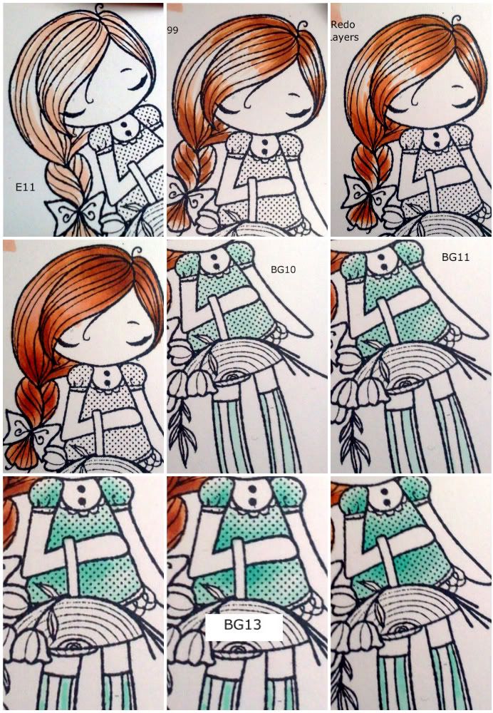
The flowers were very simple. I started with Y000, added Y11 and lastly YR21 and Y35 to the very bottom of the flowers.  I used the clear spica on the very tops of the flowers to add a little shimmer. Next the leaves, YG11, YG13 and a little amount of YG17.
Last was the skin.  The pics are a little out of sequence and I apologize for that.  I started with E50 around the edges of the face, arms and legs.  I than added E00 under the bang and forhead, inner arms and legs under the basket.  E21 added in the same areas as E00 but in a less amount.  I than used R12 (separate picture) to add color for her cheeks; I want to make her look sunkissed.  Lastly, I went back to E50 and blend, blend, blend. 
Here is the card finished.  Very simple, but I like it :o)  I used vellum for the paper behind her that was colored with BV02 to make the image pop a little more. 


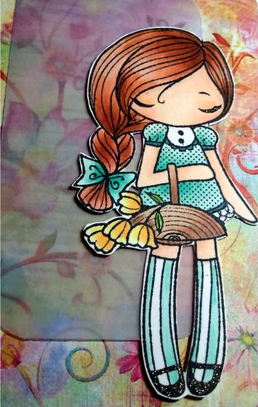
And here is the image completed.  You'll notice the colors are a little more bold as the ink has settled and dried at this point.  I went over the image with my spicas (LOVE these!) and added pitch black to her shoes and eye lashes, and peach above her eyes as an eye shadow and clear on her hair dress and flowers.

thanks for looking!!!


Stamps: TGF Miss Anya Collection, SU! Well Scripted (No longer available)
Paper:   Bazzill Simply Smooth, Prima Paper
Ink:       Memento Tuxedo Black, Copics, Atyou Spicas
Stash:    corner rounder, vellum   
Skin: E50, E00, E21, R12, Peach, Pitch Black Spica
Dress/Socks: BG10, BG11, BG23, BG13, BG18, Clear Spica
Hair: E11, E97, E99, Clear Spica
Basket: E31, E33, E44
Leaves: YG11, YG13, YG17
Flowers: Y000, Y11, YR21, Y35, Clear Spica
Vellum: BV02

Thursday, February 24, 2011

Vicki's Dive Team Poster

My daughter is on the Varsity Dive Team at her high school, and our Sectional competition is on the very near horizon! As an encouragement to the girls, each of the parents is asked to make a poster for their daughter, to be placed in the hallway going into the pool. This is what I created for my daughter. (Her name is Carleen, but we call her "Charlie"...and the dive team calls her "Chuck"...which is where we got "Good Luck Chuck"!)


On the bottom, I used my Cricut Expression Machine and the Everyday Paper Dolls (EPD) cartridge to create the 'swimmer girl', selecting cardstock to match her school colors for her swim suit. She is blonde, so I used my Copic markers to 'highlight' her blonde hair with accents of browns and golds. I placed a tiny piece of blue for her eyes behind the eye cutouts, and then used a black marker and white gel pen to give the eyes a realistic look. I used chalks to put pink in her cheeks. The diving board on this cartridge is a high board, so I simply cut off the legs of the board to create the shorter one-meter board. I actually cut the board three times, in different colors. I used the aqua as the base, and cut out only those sections in cream and metallic silver (AC Metallic) that I needed for the details. The water in the pool for diving really isn't wavy, but I still wanted to get a watery effect. I cut several 12 inch sections of the waves from the EPD cartridge, and used white chalking ink to highlight the 'wave' portions. The pool walls are typical blocks, so using a black marker, and my Tim Holtz ruler, I designed the large 'subway tile' look for the background.


The judges score cards with '10' on them are from Graphically Speaking. Using my Gypsy, I used the 'Tag' base, and placed the '10' inside the tag. I cut the base of the tag without the numbers, in red cardstock, and then cut the whole tag, with the numbers cut out of it, in black, and glued them together.


The "CPHS" letters on the wall are done with Base Camp, and the top letters are from "Hannah Montana". I used a similar technique with each of them, just with different colors. I used my Gypsy to create the Shadow layers first, and welded those together. Then, once I got the sizing exactly how I wanted, I created the regular letters on a separate layer of my project to fit inside the shadow layer. This is really easy to do with the Gypsy!! The shadow layer is a simple cut, however, I had to pull out my 12x24 mats since the lettering is so large. The top layer was 'drawn' first, using the Cricut markers, and then, without unloading the mat, cut - swapping out the marker for the regular blade. Then, I used my Sakura Quickie Glue Pen to adhere the letters together.

Cutters Creek Items used:
Cricut Expression Machine
American Crafts Metallic Foil Card Stock - Silver
Tim Holtz Design Ruler
Sakura Quickie Glue Pen
Glue Glider Pro

Cricut Cartridges Used:
*Note* Kim can special order any of the Cricut Cartridges you might want!
Base Camp
Graphically Speaking
Hannah Montana
Everyday Paper Dolls

Wednesday, February 23, 2011

Stained Glass Stickles by Chris

To Make the image: Gather together Acetate Sheet, Stickles, a stamp, and Staz-On Black Permanent Ink. Stamp your image on the acetate and let dry 3-5 minutes or use your Heat Tool to speed the process.


Just be careful to keep it a distance from the acetate as it will melt. Once dry decide what color Stickles you want to use and then working on the back side of the stamped image, begin at the center and work towards the edges, color your image. Be generous with the Stickles.


I outlined areas with one color and then filled in with others. My flower center used Yellow and Cinnamon. The smaller floral petals are Glam Pink with wisps of Fruit Punch between them.


I then outline the larger petals with Lavender and filled them with Thistle.


The leaves are outlined with Mystic Green and filled with Patina. Leave the image to dry overnight. (This is very hard for me; I am not a patient person) Once the image is dry and you are sure you didn’t miss any spots, cut around the design leaving an edge of transparency all around the image and prepare your card. (If you did miss a spot or two just add more Stickles and set aside to dry again.)


To Make the Card: My card base is a 12 x 6 piece folded in half to make a 6 x 6 square (not my usual A2 card). I glued a designer sheet on top of the base with Scor Tape. I then used my Spellbiners Nestabilities Labels 10 dies (the second and third largest) to make a frame to set off my stained glass image.


Before running them through my Big Shot, I used removable tape to make sure they didn’t slip and then cut my Mulberry Pink American Crafts glitter paper. I also used my Spellbinders Borderabilities Lotus Border Petites and glitter paper to put a border inside the card. Don’t throw out the small petals that you get from the border; they were used to make the two flowers in the top corners. All I did was glue two pieces with quick drying glue and added a Twinkle Jewel in each center.


I then made a sentiment tag using Spellbinders Shapeabilities Fancy Tags and some translucent paper I had in my stash. I colored the ends of the tags with the lavender pen in the Sakura Gel Pen set. This was glued down with Glue Dots Vellum sheets. (I haven’t decided what I will use this card for so I left the tag blank for now.)


To adhere the stained glass to the card use some Glossy Accents (on the Stickled side) and turn over and stick to the card and you are done.


Boy, don’t you just love how the stamped lines are highlighted by the Stickles? I know I do! Let’s see what you create.


Cutters Creek Shopping List:
Acetate Sheets
Stickles: Yellow, Cinnamon, Glam Pink, Fruit Punch, Lavender, Thistle, Mystic Green, and Patina.
Staz-On Black Permanent Ink
Heat Tool
Scor Tape
Mulberry Pink American Crafts glitter paper
Spellbiners Nestabilities Labels 10 dies
Spellbinders Borderabilities Lotus Border Petites
Spellbinders Shapeabilities Fancy Tags
Sakura Gel Pen set
Glossy Accents

Tuesday, February 22, 2011

Tutorial Tuesday - Custom Glitter Paper with Lori

I think we've all been there - staring at that gorgeous sheet of glitter paper, wondering if it's worth the $2 or more for that one piece of paper.  And wondering if it's really the "right" paper for our project.  Wonder no more, my friends, because you can make your own with ANY paper you like.  Just choose your paper(s) and choose a coordinating shade of Stickles and you're ready to go.  Check this out:


First, I assembled my card base, with the floral pattern paper and the two layers for the band near the top.  I generally choose only one color of Stickles, and only one of my patterns to glitter.  If you're not sure what color to use, a white or silver is generally a safe bet.  Choose one area of your design to highlight.  For my floral pattern, it was easy.  I chose one color of rose and a coordinating color of Stickles.  Then I traced the petals of the flowers with my Stickles and set the card aside to dry.

Since I was using a matching tag on my card, I highlighted the same colored areas on the tag.  Here's a closeup of some of the glittered areas.  Doesn't this look better than any glitter paper you've ever bought?!  I love that I can use any papers I like and make them as glittery as I please, and its not going to cost me anywhere NEAR $2 a sheet!

Items available from Cutters Creek:


And here is the lucky winner of the Tropical Tangerine Stickles... Random.org chose number...


And that lucky commenter is:


Congrats, Tammy! I will be emailing you shortly for your mailing information!!!

Sunday, February 20, 2011

Red Hats Everywhere with Sandi

Every year the Red Hat Chapter I belong to hosts a social event and we have around 400 guests. I make the signage and table numbers and this year the theme was Beach Bash.

I began with the Welcome sign:


I cut the letters from the Cricut Plantin Schoolbook cartridge. I found the seashell images in MTC (Make the Cut) and used Pop Up Glue Dots to attach them. I found the butterflies which are actually hair clips and pulled off the clips and used a Hot Glue Gun, like the brand new I-Bond. I added Purple Stickles for the Bling factor. I cut the flip flops from a hand drawing and used Christmas Red Stickles to draw the straps. I found the big purple flowers and they too were hair clips and the roses in the center I made from a pattern I found in the MTC library. I adhered them with Glossy Accents and added Christmas Red Stickles. There can never be too much Bling and Glitz at a Red Hat Event. Each of the Roses along the bottom are made from the MTC library Rose pattern.

This is our Chapter Queen standing beside the welcome sign:


Next I made the table numbers. I found seashell and flip flop stamps and used the Ranger Adirondack Acrylic Paint Daubers in Wild Plum on the stamps and along the edge of the card. The edges are cut with decorative scissors. I added Christmas Red Stickles to the flip flop straps and red dots here and there to add a bit a bling to the overall image.


I made several signs and this one I like because I found the cards in the MTC Library and added Christmas Red Stickles to the hearts and Red and Purple Stickles to the Snacks sign. It’s all about the Bling!


And finally, I made a Flag Holder for our Chapter Flag. I used the
Ranger Adirondack Acrylic Paint Daubers to cover the wood and lots of Red and Purple Stickles.


Cutters Creek Shopping List:

Ranger Adirondack Acrylic Paint Daubers
Stickles
Pop Up Glue Dots
Glossy Accents
Cricut Machine

Thursday, February 17, 2011

Tutorial Tuesday on Thursday with Mandie

Welcome to another Tutorial Tuesday! Yes, I realize it's Thursday but a mouse invasion in my scraproom put a damper on my mojo (not to mention my DESK). Thankfully, I believe the problem has been resolved! This month we are focusing on Stickles! Stickles are a great way to add a little bling to any project! There are a TON of colors and Kim has the newest ones available in the store right now... and one (or maybe two) lucky commenters on today's post will WIN their very own bottle of Tropical Tangerine to play with....


I got this really cool sheet of images on a transparency from the Prickly Pear booth at CHA and couldn't wait to play with them! So I grabbed my Stickles and started coloring with them on the back of the image. I used Christmas Red, Silver, Turquoise and Diamond to color my balloon. Just remember, there is a lot of dry time here so I recommend letting it dry overnight.


This is actually the second day. I added the Red, Turquoise and Silver first and let them dry. In the morning I colored in the rest of the balloon with the Diamond Stickles and let it sit all day. Well, last night when I went to finish my project I guess I had made my layer a little too thick and it was still wet! So I moved on and made the background for my card.


I'm including two photos of the background I created because it was really hard to get a good photo. I used my Glimmer Mist and Glimmer Glam to create the sky.


I first sprayed a light turquoise for the background. Then I added the Glam in a few random spots with a paint brush. It acts as a resist when I spray the 2nd color, a little darker turquoise over the top and gives a really cool effect! I'm thinking I'm going to create a water themed page next with this same technique... Then I had cut the clouds from white cardstock and glued them down.


When my image was finally dry I added some foam squares to the back of the transparency under the colored part of my image. I really wanted the balloon to float off the page.


And here's the finished card! I added a little red foil paper from my scrap drawer and stamped the phrase "Ain't Life Swell" from my Pink By Design Country Life stamp set. I also used my Pink ATG to assemble the rest of my card.

Now on with some business... first I would like to announce the winner of the Glimmer Mist challenge! We had three participants so I went in the order they posted their links....


and Random.org chose.....


CONGRATULATIONS KIM!!!! You win! I will be sending you an email for your info so watch your inbox! Can't wait to see what you create with your new Glimmer Mist!

Now, don't forget to post your comment on this post for a chance to win a bottle of Tropical Tangerine Stickles! I will leave comments open until Monday Feb 21 at 11:59pm and announce the winner in our next Tutorial Tuesday post!

Cutters Creek Shopping List:
Stickles:
Christmas Red, Silver, Turquoise and Diamond
Glimmer Mist
Pink ATG

Tuesday, February 15, 2011

The Greeting Farm Stamps with Mandie

So Kim and I are back from CHA and sort of back to normal now... it's hard to believe how being gone for a week can throw you off so much! (See my note at the end of the post regarding Tutorial Tuesday.) It was so amazing to see all of the new products! I'm so happy that Kim decided to add The Greeting Farm stamps to the Cutters Creek store. They are made from high quality, deep-etched, red rubber for wonderful impression every time! They are also mounted on gray cling cushion. All you have to do is trim and use with acrylic blocks. I have two cards that I created with these images. I used some of my favorite Echo Park Paper scraps (and one piece of patterned cardstock from my stash) on both of these cards.


The first card I used the Cheeky Shooter stamp from The Greeting Farm! When we saw the Cheeky Cherry Collection we were both super excited! These stamps are great to color and they stamp beautifully! I hope you guys love these images as much as I do! I used my Flesh Toned (E000, E00, E11 and R20) Copics for her skin and my Bic Mark-It's and Tombow Markers for the rest.


Then I accented the gun, star on the boots, studs on the belt and her eyelids with my Sakura Gelly Roll Stardust Pure Glitter Pen. After she was all beautifully colored just the way I wanted I grabbed my oval cutter... and realized that I need to get a set of the Spellbinder Ovals, LOL! So I inked up the edges of my oval with a little Tim Holtz Distress Ink in Walnut Stain to disguise the imperfections... The outer oval I actually just colored with the same marker I used on the cowgirl hat.


Then I used some Pop Up Glue Dots to lift my ovals off the card. The only other addition I made was a piece of brown felt ric rac adhered with some Scor Tape. Oh, and I should mention I used my Pink ATG to adhere everything else on both of my cards! I am sooooo happy that I broke down and bought one. I have loved using it!

The second card uses the Because Of You sentiment set from The Greeting Farm. When I saw the "I like you more than puppies" phrase on there I BEGGED Kim to add this set to the store! The other phrases on this set are: Today is Brighter because of You, It Doesn't Get Much Better than This, Everyone Needs a Friend Like You, You're the Rainbow After the Storm, Life Would be Boring without You, and You Twinkle More than Stars. What a great multi-purpose set!

And at only $14.99 - what a STEAL! I'm sounding like a serious commercial right now, LOL! But I'm super excited about this set. The little girl I used is from the "Roll Call" set which isn't currently in the store BUT I'm sure if you ask nice, Kim could look into getting it. The set comes with 8 of the characters plus a set of phrases and retails for $48.00. I used my Flesh Toned (E00, E11 and R20) Copics for her skin and my Bic Mark-It's for the rest.


I added the Sakura Gelly Roll Stardust Pure Glitter Pen to her shoes, shirt and bows and a little for eyeshadow. Then I added one of the Color Me Crazy flowers with a corduroy yellow brad for the center.

I hope you enjoyed both cards I have to share today. I will be doing the Tutorial Tuesday post on THURSDAY this week due to the mouse that is trying to share my scrapbook desk. Make sure you check out my post because there will be some BLOG CANDY posted too..... Oh, and I will have the announcement of our Glimmer Mist Challenge Winner too!!!

Cutters Creek Shopping List
Cheeky Shooter stamp from The Greeting Farm
Because Of You sentiment set from The Greeting Farm
Echo Park Paper
Copic Markers: E000, E00, E11 and R20
Sakura Gelly Roll Stardust Pure Glitter Pen
Spellbinder Ovals
Tim Holtz Distress Ink in Walnut Stain
Scor Tape
Pink ATG
Color Me Crazy

Thursday, February 10, 2011

Cupid's Arrow by Laura C

This card starts with a 5&1/2" by 4&1/4" base of kraft cardstock.  I centered a Spellbinder Classic Heart Die in the middle of one side, taped it down to hold it in place, and ran thru my Cuttle Bug.  Then I used Tim Holtz Distress Embossing Ink to stamp the flourish from the Stampers Anonymous "Fairytale Frenzy" set, and embossed it in pink.  Then I inked this base in Distress Ink in Vintage Photo. The ticket is from the Stampers Anonymous "Love Struck" set, and is also embossed in pink, and then inked with Vintage Photo.  Cupid is also from the "Love Struck" set and is stamped in Vintage Photo Distress Ink on kraft. I added a little more Vintage Photo ink to fill in the image a bit, and then I sprayed it with Iridescent Gold Glimmer Mist.  I put a 5&1/4" by 4" piece of pink  patterned paper that was distressed with Vintage Photo Ink, on the inside of the card.  Then I layered in Cupid so his arrow was hitting the heart on the flourish stamp, and used foam tape to raise up one edge of the ticket....and added some Kaiserkraft
rhinestone bling. Cherry Chocolate Twinkle Jewels add a nice accent in each corner, and a bow and extra bling from my stash finish it off.  

So with a card this pretty....which special Valentine would you send it too??  

Available at Cutter's Creek:

Spellbinder Dies (Classic Heart)
Stampers Anonymous (Fairytale Frenzy and Love Struck)
Tim Holtz Distress Ink (Vintage Photo and Embossing Ink)
Tattered Angels Glimmer Mist (Iridescent Gold)
Kaiserkraft Rhinestones (Light Pink)
Twinkle Jewels (Cherry Chocolate)

Tuesday, February 8, 2011

Tutorial Tuesday--Stickles Stenciling Lacey Valentine by Laura


Stickles is such a fun product with so many possibilities!  One is to actually use stickles with stencils or lace.  I used a wide floral lace and fruit punch Stickles.  I just laid the lace onto a plain white piece of paper, and then squeezed a generous amount of Stickles onto the lace and started to spread/pat it onto the lace, like this:


I continued until the lace was completely covered, then I carefully lifted the lace off of the paper (stickles were still wet!) and I made sure to save the lace too! The result was this:


While the Stickles dried, I prepped the rest  of my card.  I cut a 5&1/2" by 4&1/4" base of black cardstock.  I used the Graphic 45 (G45) 12x12 Le'Romantique paper pad and cut a 5&1/4" by 4" piece of the small butterfly print, used a distresser on the edges, and enhanced it with Spun Sugar Distress Ink. The butterfly tag is also from the G45 collection...I punched it out and also distressed and inked.  The small butterfly in the bottom right corner was cut from the G45 paper as well, slightly inked with the Spun Sugar, and embellished with pink rhinestones.  Once the
Stickles were completely dry, the lacey print was trimmed to 1&6/8" by 4&1/4" and inked with Spun Sugar, and black cardstock was cut to 1&1/2" by 4&1/4" and edges distressed, to lay underneath the lace piece.  The flowers in the lower right corner were cut out of the stickled lace for a pretty glittery accent.  A bow here a brad there, and it's complete! 

Give stenciling with Stickles a try.....so many possibilities!!  And link up your projects, we'd love
to see!!!

Available at Cutter's Creek:

Graphic 45 Le'Romantique 12x12 paper pad
Tim Holtz Distress Ink (spun sugar)
Stickles (fruit punch)
Kaiserkraft Rhinestones (light pink)

Monday, February 7, 2011

Framed Heart Valentine by Laura

Simple and sweet, this Valentine would
make anyone's Valentine's Day special!


The base is 5&1/2" by 4&1/4" white cardstock
that has been inked with Tim Holtz Victorian
Velvet Distress Ink and then Vintage Photo on
top of that. The center of the "frame" is cut
from white cardstock using Spellbinders Classic
Oval Small, and I inked it with Victorian Velvet
while it was still in the die.  I used Ranger 
Distress Stickles in Antique Bronze around the 
edge, and set it aside to dry.  The outer part 
is cut using Classic Scallop Oval Small cut from
kraft cardstock, and the edges inked with Vintage
Photo Distress Ink. The heart is from the Stampers
Anonymous "Love Struck" set, and it's stamped on kraft
in Victorian Velvet.  I cut around it, distressed the
edges, and added a little Vintage Photo ink to "pop"
the distressing.  The I applied a layer of Rock Candy
Distress Stickles to the heart....I used a heat gun
to dry it quickly.  I used some seam binding tape from
my stash to accent the "frame", then layered on the 
frame and used foam tape under the heart to give it
dimension.  Some little roses and bling from my stash
finish it off.  

More Valentine goodies to come....make sure you keep
checking the blog every day!!

Available at Cutter's Creek:

Tim Holtz Distress Ink (Victorian Velvet and Vintage Photo)
Spellbinders Dies (Classic Ovals Small and Classic Scallop Ovals)
Ranger Distress Stickles (Antique Bronze and Rock Candy)
Bazzill Simply Smooth Cardstock (White)
Related Posts with Thumbnails