Showing posts with label Tim Holtz Distressed Ink Pads. Show all posts

Sunday, April 13, 2014

Love Is In The Air! By Fran


OLYMPUS DIGITAL CAMERA

OLYMPUS DIGITAL CAMERA

The digital stamp is called First Love by Sassy Cheryl.  And so I took it one step further and made it mine with Love Is In The Air!  I was going for whimsy but maybe I over did it. But any who I still like how it turned out.

My Recipe:  My card is 4-3/4” by 6”.  All elements were cut on my Silhouette machine except for the butterflies (MS Punch).

The background paper is watercolor paper.  I used the new Tim Holtz Spritzer (my new favorite item) and Distress markers in two colors and spritz the paper.  Then I used a paintbrush to water color in the sky.  If you haven’t bought yourself one of those spritzers you are missing out on a awesome tool.  It is not hard to use once you find your rhythm.  I used the new smaller blending tool to enhance the edges.  And Glossy Accents which is my most favorite medium.

All the coloring was done with several different mediums:  Copic Markers, Prisma Colored Pencils, Inktense Pencil, Distress Ink Pads and Markers, and Wink of Stella Glitter brushes

Copic Markers:  Olive, Apricot, Golden Yellow, Baby Blue, Veronese Green, Frost Blue, Light Grayish Cobalt, Pink Flamingo, Egg Shell, Brick Beige, Warm Gray #3, and Blush.

Prisma Colored Pencils:   Chocolate, Ginger Root, and Denim Blue.

Inktense Pencil:: Dark Chocolate

Distress Ink Pad: Stormy Sky

Distress Markers: Stormy Sky and Tumbled Glass

Stop over the Cutters Creek Store and check out the new items and the all time favorite items.  And if you have any questions you can contact Kim.

Sunday, October 27, 2013

Thank You Card by Fran

 
I want to share a Thank You Card I made for a special lady who made Chuck and me a Cross to mark Butch’s (our pet dog) grave.  I tried a new product (new for me) on the card called Fran-tage Encrusted Jewels.  You can purchase Fran-tage from Cutters Creek Online Store.
OLYMPUS DIGITAL CAMERA
(Click on photo for a closer view)
If you like to see a great demonstration of  how to use this cool product go here to watch a YouTube video.
 
Card Details: 
Card Base, Tag, and banner all made using Neenah Card Stock in Ivory. 
Pink paper from my stash was dry embossed with a Cuttlebug embossing folder called Mesh.
Fran-tage on the tag and butterfly is called Shabby pink and Shabby Blue.  Plus I added Aged Gold.  In addition I added some Shaved Ice fragments that gives a Mother of Pearl look.
The tag was cut using my Cuttlebug and a Die by Marianne Design Creatables (LR0154).
The flowers, butterfly, and pink filigree swirls are from my stash.
I used Antique Linen Distress Ink on the edges of the card and banner for a vintage look.
And the card is held together using two of my favorite adhesives: Glossy Accents and Tombow Permanent Adhesive.
Attached adhesive pads to the banner for dimension.  And the banner was created in Paint Shop Pro adding the small butterfly on the corner.
All the flowers were painted with a Wink of Stella Clear Glitter Brush.  And the pink filigree swirls were painted with Clear Glaze 3-D Glossy Ink pen by Sakura.
Remember Kim may be able to order any products I used that are not in the Cutters Creek Online Store.  You can contact Kim HERE.
And in addition Kim runs several craft clubs on a monthly basis giving you an opportunity to build your craft supplies at a discounted price.  You can learn more about the clubs through the Cutters Creek Yahoo Group.
If you like to join the Group you can go here to join.

Thank you for stopping by and  I hope I tickled your crafting mojo a little.  

Signature for Blog

Thursday, August 22, 2013

Get Well Card by Fran


I colored a cute Fairy and thought how nice it would be as a Get Well Card.  The image is called Peaceful Thoughts Fairy by Carmen Medlin for SCACD Digital.

OLYMPUS DIGITAL CAMERA

Note:  Color of dress is actually a deep pink.

The sentiment used on the inside of the card reads:  “Wishing You a fairy speedy recovery”.


Details:  The card measures 6” by 6-1/2”.   All papers are from my stash.  I used three circle dies measuring 5-1/2”, 5-1/4”, and 5”.  The digital image was colored using Prang Colored Pencils and Gamsol to blend the colors. 

The yellow butterflies were punched using a Martha Stewart punch.  The ribbon is made from seam binding and I colored it using Worn Lipstick Distress Ink Pad. 

All the tiny roses used are by Prima.  I added Baby Blue and Worn Lipstick Stickles to the roses and the center flower.  The center flower on the ribbon was hand made using a Retro Flower Punch. 

The digital image and butterflies have Star Dust Stickles on them for added enhancement.  The pearls are by KaiserCraft.  I rounded the bottom corners of the card using a Crop-A-Dile Corner Chomper. 

Framing the digital image are tiny dots of Baby Blue Stickles.  Everything is held together with hot glue and Glossy Accents by Inkssentials.  

The following list of products used on my card can be purchased from the Cutters Creek Store:

Tim Holtz Distress Ink Pad (Worn Lipstick)

Tim Holtz Distress Stickles (Worn Lipstick)

Tim Holtz Stickles (Baby Blue and Star Dust)

Inkssentials Glossy Accents

KaiserCraft Pearls (Bliss & Hot Pink)

Prima Roses

If you have any questions about the products you can contact Kim Bush here.

Thank you for stopping by, Fran


Tuesday, June 4, 2013

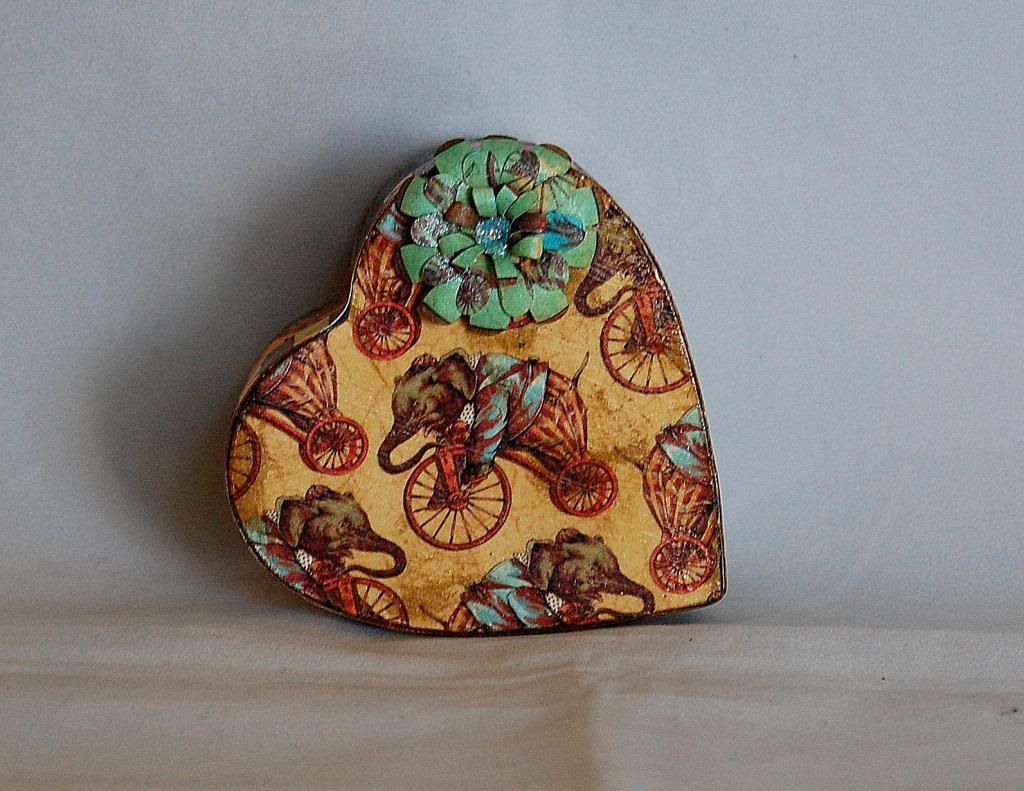
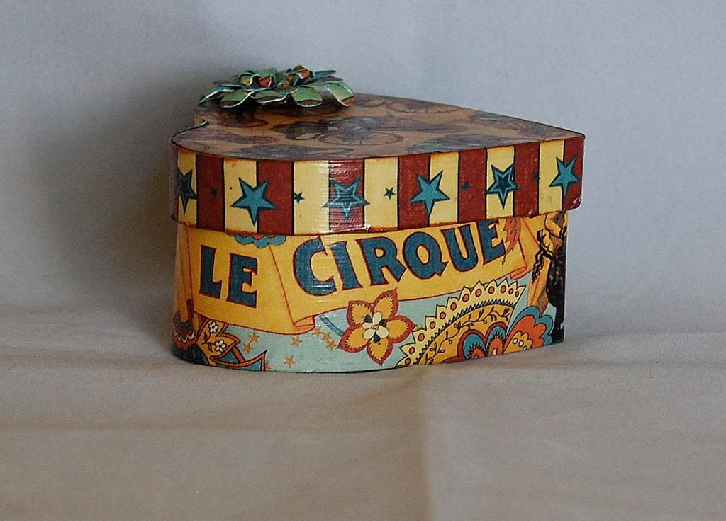
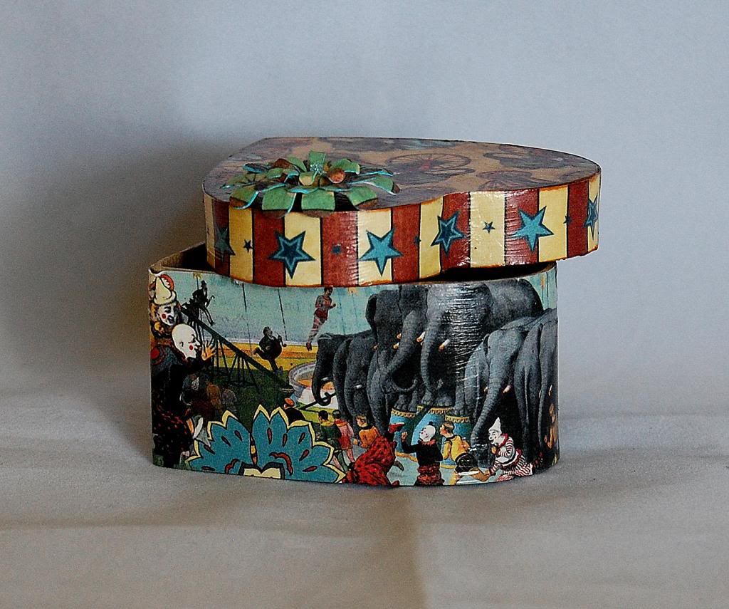
Le Cirque Graphic 45 tricket box by Jearise

Today I am showing off a paper mache ticket box I decorated using the Le Cirque Double-Sided Paper Pad from Graphic 45. I discovered that Mod Podge works perfecting for attaching the paper and bringing out bright colors. Please contact Kim if you would like to order some Mod Podge.


Here are the directions on how I decorated this box.

First, I measured the sides of the boxes height and then I cut out the strip and played with wrapping it around the box to show different scenes. I decided I liked the elephants on one side and words on the other so I brought the paper together in the middle of the heart and made sure it overlapped some before cutting.  It's important to have it over lap in case you cut it shorter than you thought you were.

Once I had the paper Mod Podged on, I went back and trimmed it down to the edge of the top of the box using my utility knife and scissors.

Then on to the top....

I centered my elephant in the middle of the box and trimmed around the outside edge using my utility knife and scissors and then I Mod Podged the paper on.

I did the same thing with the trim for the top sides that I did with the bottom sides of the box.

I then went back and inked all the edges and added a touch of ink to the paper on the top and sides as well using the Tim Holtz Distress Ink Pad-Tea Dye.

I added some of the Tattered Angle's glimmer mist and a flower I made using the Cricut Cartridge Flower Shoppe. I used some Stickles in Baby Blue for the center of the flower. I attached the flower using Scotch quick dry adhesive.

There you have it in a nutshell, an easy project that is fun to do and doesn't take a lot of time. I even let my 8 year old decorate her own box using my paper scraps.

Have a great day! Jearise


Saturday, May 11, 2013

My Version of Gate Fold Card by Deanna M

When I set out to design this project, I knew I wanted to do something a bit different then my typical A2 card. I did some blog hopping and decided I wanted to make a gate fold card. But I decided I wanted to create my own version of a gate fold card and that is what I did.


I started with a piece of white card stock cut to 5 1/2" X 12". I die cut one edge using a Tim Holtz on the edge butterfly die. (Check with Kim if you are interested in this die). My next thought was how to dress up the butterlies. Once again Tim Holtz to the rescue. I placed several different colors of distress stain (I used Peacock Feathers, Squeezed Lemonade and Shaded Lilac) I then spritzed the distress stains with water and and swished my butterflies in the stain. I then let them dry. I added some Buttercup and Lavendar Lace Liquid Pearls to the bodies of the butterflies.

Once the butterflies were all dried I scored my card stock at 3 1/2" from each end. I heavily inked all the edges of my card with Peacock Feathers Distress Ink (this is one of my favorite colors).  I added a black mat and then my patterned paper mats. I also did the inside of the card.


My next dilemma was how to finish the card. It just needed a bit more. I took another piece of white card stock and again applied some distress stains to my mat. This time I used Peacock Feathers, Seedless Preserves, Salty Ocean and the Burnish Pewter Metallic stain (again Kim can order these for you, just ask). I again squirted the stains with water on my mat and just swished the paper across my mat to color the entire page. I then spritz the paper with a bit of water to get the colors to flow. I allowed the paper to dry thoroughly. I cut two butterflies using my Silhouette cameo. I cut the base layer using the stained paper I created. The top layer was cut using the tracing paper I have it is a bit transparent.

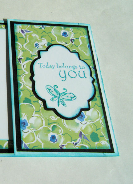
To finish the front of the card, I cut a mat using Elegant Edges (again Kim can order this for you) at 3". I cut the shadow out of black and the base layer out of white. I inked the white mat with the Peacock Feathers distress stain and stamped my sentiment and the butterfly. I used my Turquoise Spica pen to enhance the lines of the butterfly and use the Clear Spica pen to add sparkle inside the wings.

I sure hope you enjoyed my version of a Gate Fold card. I would love to see you all create your own version as well and share it with me. I think this card would work great for a Mother's Day card, Birthday card, or even a Graduation card. What do you think?

Tuesday, March 19, 2013

Quick and Easy Easter Basket by Deanna M


Welcome Tutorial Tuesday! Hope your week is off to a great start.  Today I have for you a quick and easy Easter basket. Perfect for a hostess gift, gift for co-workers, friends, just about anyone, or the center of your Easter table.

I happened to come across this great tutorial at Scor-Pal on making a box. I knew I wanted to make a simple basket and wanted it 4" across the bottom and I wanted 3" sides. Based on the formula in this tutorial (4+3+3 which is the box size plus two times the height size) I knew I needed to cut a 10" square to make my box and then score each side at 3". I then cut the flaps as indicated in the tutorial.

This picture is from the tutorial

I adhered my box using scor-tape. My handle which was just the 2" X 12" strip of patterned card stock I cut off to make my 10" square. I attached my handle to my box behind the outside flap so the bottom of my handle was hidden.

Now that the basket was together, it was time to decorate it. I cut my rabbit from the Easter 2010 Cricut cartridge at 2 1/2".  I ran the rabbit through my Xyron sticker maker upside down so the sticky was on the front of my bunny.

Okay so now I have a confession to make. I thought that at some time in the past I had purchased the Earth colored Ultra Fine Flower Soft. However, if I did, I sure couldn't find it and was not where I store my flower soft. So now I had a dilemma. I wanted to make my rabbit furry, so what to do? I took some of white Ultra Fine Flower Soft and added several drops of  ginger alcohol Ink to it in a plastic sandwich bag and rubbed it around in the bag to get the color I ended up with. However, I also ended up with ginger colored hands and it had a bit of an odor to it from the alcohol ink. So while it worked in a moment of panic I plan to get some of the Earth colored Ultra Fine Flower Soft when Kim has it back in the store. Just much simpler to us.Once I had my bunny sticky and the flower soft the color I wanted I added it to the front of the bunny and pressed down on the flower soft (that's how I got the colored hands) to be sure it stuck to the adhesive. I then added a bow at his neck and a google eye to him and adhered him to my basket.


Next I cut the grass. The grass is also from the Easter 2010 cartridge and was cut at 1 1/4". Each strip is actually 2 of the images that I flipped and welded together on my Gypsy. You could do the same thing with the Cricut Craft Room if you don't have a Gypsy or Design Studio. I cut my grass out of some Core' denations paper and the light green is actually the back side of the card green. I adhere the grass to my box at the bottom and then fluffed up the grass to give it some dimension

For my Easter eggs, I cut these from the Doodlecharms cartridge using real dial size and 3/4" and 1". Before cutting the eggs I grabbed some scraps of card stock in pink, yellow and lavender. I used my WOW! Funky Border Strips clear stamps and several colors of distress ink to create some patterned paper to cut my eggs from. If you haven't tried any of these clear stamps you should. WOW! makes them so they work really well with their embossing powders (just a suggestion all you WOW! club members). Kim carries several of their stamps sets. It is worth checking out.


On the lavender paper I used the Peacock Feathers Distress ink and the small dot border stamp. On the Yellow paper I used Shaded Lilac and the small squares border stamp. On my pink paper I used the Squeezed Lemonade and the Pickled Raspberry distress ink and the single row of dots border stamp. I first stamped the Raspberry and left about an 1" between the two rows, then went back and stamped the Lemonade between the Raspberry.

Once I had the eggs cut out I used my Spica Pens to add a little glitter to the eggs and then adhered them to the front of my basket.

I hope you enjoyed seeing my basket and will check out the awesome products used from Cutters Creek. And remember if something is ever out of stock just contact Kim through the Customer Service link and ask if she can order it for you. She is great about special ordering so never hesitate to ask.

I hope you all of a great rest of your week. I would love to know what you think of my basket.

Tuesday, February 12, 2013

My Heart Belongs 2 U....by Laura C

Sometimes....don't you want to just get inky and have fun?
That is what this project is about....just pulling out
different inks, paints, stamps.....and having a 
crafter's paradise of playtime!


I started with a blank base tag.....then I stamped and
embossed the heart (a Tim Holtz stamp) using WOW embossing
glitter in Angel Wings then inked the rest of the tag up
with Distress Inks:
Festive Berries, Barn Door, Shaded Lilac.
I dripped water on it to give the background
a more distressed look. 

After using a distressing tool around the edges of
the tag....I reinked with more Barn Door ink.
Then I lightly brush the tag with Adirondack
Paint Dauber in Pearl.  I also used the daubers
on the metal #2....first Red Pepper, then while
still wet....some Pearl to mix it into a silvery pink.
I also used the Pearl to fill in the word "Cherish" on
the metal tag and brushed it around the edge of
the plastic TH fragment piece under the letter
"U".....that piece was also colored with Red
Pepper Alcohol Ink.  Then I inked up the
love definition stamp from the TH
"Love Struck" set in white, and stamped
randomly on the tag.  Then it was just finishing
touches....a bit of TH tissue tape under
the letter U (which is a TH sticker) and
attaching TH baubles, charms, and some
seam binding ribbon.

Many of these fun items are in Cutter's Creek,
if you can't find them in store....please ask Kim,
she is glad to order for you as well!

Take some time to have a little of your own
creative playtime....hope we can inspire you to
do just that!

Tuesday, September 25, 2012

Cricut Flower Shoppe Flowers by Tee


I have gotten a lot of very positive feedback on my roses made with the Flower Shoppe cartridges that I decided to make a video to walk you though making them.


See the video here:


I cut my flowers at 2 1/2" and inked with Tim Holtz Distressed Inks.

I hope this video inspires you to make your own! If you do, please make sure you post so I can see.


Friday, June 1, 2012

Father's Day Blog Hop

Welcome to the Cutters Creek Design Team Fathers Day Blog Hop! We want you to hop along with us and play for the Grand Prize The objective for our Blog Hop this weekend is to inspire you to create something beautiful for all of the "Fathers" in your life! We have a bit of everything, from cards to gift ideas to layouts about our fathers!


Take an old pink and white frame, a bit of paint, and Graphic 45 paper and turn it into a Father’s Day gift. The first bit of transformation was painting the whole frame with black acrylic paint and then slathering it with Vintage Photo Distress Crackle Paint. Once it dries and cracks, rub some Black Soot Distress ink into the cracks and rub off the excess with a soft cloth. Next take your chipboard letters and glue them to Graphic 45 paper. These used two sheets from the Olde Curiosity Shoppe pads and some Aleene’s Quick Dry Tacky Glue. Once they were dry I inked the edges using Gathered Twigs for the word Pappy and Peacock Feathers for the We and U, and I used Glossy Accents to add some shine to the bottom letters.

I then chose a coordinating cardstock (also from the Olde Curiosity Shoppe set) and covered the mat. I used Scor-Tape to adhere it to the backside. To add a bit more depth I stuck a piece of Inkssentials Foil tape sheets to a remnant piece of cardstock and cut it with Tim Holtz’s On the Edge Steampunk.  I used several different alcohol inks to age it and then glued to the mat with Glossy Accents. Next I took one of the Kaisercraft Wood Flourishes (hearts) and covered it with Ruby Diamond Range Flower Soft using the Flower Soft Glue.

While everything was drying, I punched a few butterflies out of leftover foil tape and Graphic 45 papers, layered them and glued them around the mat. I used mini glue dots to hold Pappy angled from the frame to the mat, Glue Dots pop dots for the letter w, and on everything else I used glossy accents again.  I needed one more embellie and turned to my Tim Holtz tickets and his stick pins, colored them with all three of the new Distress Inks (Peacock Feathers, Shaded Lilac, and Squeezed Lemonade—these are absolutely gorgeous colors!), and pushed it into the mat.

Now for the details about the Grand Prize I mentioned at the beginning of my post. Check it out! What an awesome prize don't you think???


To qualify you must leave a comment at every stop along the way. Comments should be made by Midnight, June 3rd. We will use Random.org to select a winner so be sure to check back with us on Monday to find out if you have won!

Don't forget to leave a comment here before you hop along to  Kim's Blog! Thanks for hopping by!

Monday, May 7, 2012

Designer Spotlight with Karen S.


Hi Everyone! For my card today, I have a graduation card I made with Tilda Catching Stars. I matted her using Spellbinders Romantic Rectangles and also used Tim Holtz Distress Ink in antique linen. I used paper by My Minds Eye and I made the flowers with my Cricut and the George cartridge. I added ribbon, lace, Kaisercraft pearls, stickles, a button, a mini tag, and a leaf swirl.  I hope you enjoyed my project and please leave me a comment!

Friday, March 30, 2012

Mandie's "Discover" Card

I've always been fascinated with quilting. I love the look and the texture but... I don't sew. I'm not that patient, and it's harder to "embellish" mistakes on a quilt. I can't just pop a cute flower over it! So, I decided to make a quilt with paper. I was flipping through an outdated AAA Travel Guide and I was looking at all of the beautiful photos and thought, "These would make a beautiful paper quilt!" so I grabbed my trimmer and started cutting.


I took a handful of photos that I liked and cut them into 1/2" strips. Then I started playing. I arranged them so my floral elements were on one side and my mountain/rock elements were on the other. I just loved the little fish so he became my center point. I adhered my strips into a log cabin pattern and thought it needed something more. So I pulled out my Tim Holtz Rock Candy Crackle Paint. This stuff is AMAZING! You get a beautiful fine crackle and it dries pretty fast if you do a thin coat. After painting it on with the attached to the lid brush and letting it dry I decided to add a little more depth to the cracks so I added a little bit of Walnut Stain Distress Ink.


I wanted my background to have the same organic feel as my photos so I used more Distress Ink in Ripe Persimmon (from the LE Fall collection) and Peeled Paint. Then I splashed some water on it, using some big drops and small ones to get the effect you see. Then I added some corduroy ribbon with some Scor Tape and a few brads and finally added the "Discover" with my label maker. Finally, I used some Foam Adhesive to pop up all my layers.

Wednesday, March 28, 2012

Live Life with Joy Card by Deanna M


20120323_6
I was able to get a package of the laser cut wooden embellishments from Kaisercraft. Wow, I love them. They are super thin, about the thickness of a dime. (I tried to get a picture but just couldn’t get it clear enough).  There is a wide assortment of different embellishments to chose from, like birds, birdcages, there are some gorgeous butterflies, dress forms. If you are interested in any of them just let Kim know at Cutter’s Creek and she can special order them for you. If there is enough interest we might be able to talk her into stocking them in the store.
For my card today, I started with a 4 1/4” X 5 1/2” white card stock card base. I added a mat cut to 4” X 5 1/4” cut from some Gemstone Core’denations cardstock. I love this cardstock, it is shiny, with a great glimmer. My patterned paper is cut at 3 3/4” X 5” from the Howdy Doody My Minds Eye paper pad.
For my wooden embellishment, I first sprayed it with 4 coats of Vintage Pink Glimmer Mist, allowing it to dry thoroughly between coats. Then I gave it a quick coat of Hammered Copper Glimmer Glam (another item that Kim will happily order for you). I used some Scotch Quick Dry Adhesive to attach my wooden embellishment to my card. I added a foam dot into the middle of the flower (the flower center was not solid). For my flower center I used a 3-D Glue Dot and dipped it into some Citrus Crush Ultra Fine Flower Soft. I used my finger to press the flower soft into the glue dot. I kept the glue dot on the paper backing until I was ready to adhere it to my flower center.
I used some Wild Honey Distress Ink to stamp my sentiment. To finish my card I added a rhinestone flourish from Want 2 Scrap that I just cut to fit the areas of my card.
Please be sure to leave us a comment and let us know if you are interested in these laser cut embellishments.

Monday, March 26, 2012

Mandie's Gift Box

Today I'd like to show you a fun gift box that I created. I used some fabulous Echo Park Paper, Distress Ink and Adirondack Paint Daubers, and Glimmer Mist!


First I painted all of the edges of my box with the Pitch Black Adirondack Paint Dauber and let it dry. Then I cut my Echo Park Papers (these are from the Be Mine line but you could easily use any of the gorgeous lines they have) to be slightly smaller than each side of my box. Then I inked the edges of everything with the Black Soot Tim Holtz Distress Ink.


Next I created my spiral roses. I used a variety of circles that were cut into a spiral shape. I used scalloped scissors on a couple. Then I rolled them into the flower shape. To give them a little bling, I added some Pink Bubblegum Glimmer Mist and then let them dry.


I adhered my roses to the box with some Glue Dots and added some mirrored paper leaves. Then I used Scor Tape to add the ribbon around the middle of the box. Finally, I used my Crop-A-Dile to add holes and eyelets to the sides of the box and threaded some ribbon through for a handle.

Thursday, March 1, 2012

Journal of Love by Chris

Chris1

Take a composition book (I was going to say a black and white one, but they come in all sorts of colors these days J) and some Graphic 45 paper, a little bit of time and you will have a gift that looks so elegant and, yet, is so simple to do. I started with The Magic of Oz (8x8) pad and a 9.75x7.5 inch notebook. I cut two pieces of background cardstock at 7.75 x 11 inches and used my ATG to glue it down abutting the black seam. I then folded the excess inside and glued it down. To hide the text and rough edges, a contrasting color was glued. These pieces were about 9.25x6.75 inches. Now all that was left to do was decorate it.

Chris2

On the inside front cover I made a pocket to hold a note explaining the project, Journals of Love. This one is a library card pocket I cut it with Sure Cuts A Lot, and I printed out the message on a book sign-out card. I used Spellbinders Nestabilities Postage Stamps to cut four images from the Graphic 45 paper. Two are adhered on the front cover and two on the back. On the back inside cover is also a pocket made for any loose papers the recipient may want to hold onto. I make them all different sizes, but this one started as a 5.5x7 rectangle. I used my Scor Buddy and on three sides (the two sides and the bottom) scored it three times at a .25, .5, and at 1 inch. On the top length, I cut the pocket at an angle and use a hole-punch to cut out a half circle. I then accordion folded the score lines and used Scor Tape (¼”) to glue it to the cover.

Chris 3

To decorate the front cover I first rubbed all the outside edges with Tim Holtz Aged Mahogany Distress Ink. Then I used a border punch and made two layers. (I can’t wait to get my Edgeabilities!) Next I ripped out several pieces of the Graphic 45 and ran them through my Distrezz-it-All from Zutter. (I know Kim got me mine, and if you don’t have one, she can probably get one for you too.) The sentiment is from Paulette, and was printed with computer and cut out using my Spellbinders Small Deckled Rectangles. I inked the edges of each piece with Tim Holtz Aged Mahogany Distress Ink and layered them on a scrap of black paper from my stash. To finish it off I fussy cut several of the poppies from the back cover of the pad—yes I did say from the cover of the pad—and layered them using clear ASI Kool Tak foam pads. The journal is done and on its way to a dear friend. I hope you consider making some.

Friday, February 24, 2012

A Boy's Life Layout with Lori

I am just loving the new A Boy's Life collection from Echo Park Paper!  It's really helping me get some pictures in my scrapbooks, and this time I decided to work on some older pictures I've been neglecting.  The best part is that the colors in this collection work so well with a lot of things you probably have in your stash. 


I even pulled out my Cricut Imagine (which I've also been neglecting!), since I was documenting a birthday party, and there wasn't much in the stickers that would work for that.


I printed & cut my title image from the Imagine More Cards cartridge.  I sanded & distressed all of the layers.  Then I inked the bottom layer using an ink pad in my stash that darkened the blue enough so that it would better match the papers.  I popped up all of the layers using the ASI Kool Tak clear foam squares.


These journaling circles were printed & cut from the Imagine More cartridge - they are the notebook paper centers of a flower.  The distressed feel of both the Imagine More and Imagine More Cards cartridges are a perfect match for this collection.  I popped the circles up also, because of the ribbon bulk, and added the "a perfect day" sticker from the collection.


Lastly, I added a banner using stickers from the collection and a white gel pen.  One additional item to note:in order to match the distressed feel of the papers, I used a white core cardstock and sanded it all over with fine sand paper (220) to lighten it in spots.

Items available at Cutters Creek:
Other:
  •  cardstock with a white core (I used CTMH)
  • hole punch (I used the Crop-a-dile) and eyelets
  • coordinating ribbon (I used American Crafts)
Thanks for coming by today!  Hope you come see us again soon.

Monday, February 13, 2012

Rockin' Birthday Card with Lori

I have a special birthday card I want to share with you today.  My big brother turned 55 earlier this month, and you might not think we have much in common since he is the oldest and I am the youngest.  But he was my first "bad influence", introducing me to Godzilla movies and Saturday Night Live, The Beatles and Pink Floyd, and Star Trek and Isaac Asimov.  (Come to think of it, I think I can blame him for my lack of popularity in high school, and my extreme popularity in college, lol.)  And thanks to his guitar-learning efforts, I never want to hear the song "Smoke on the Water" again.  But I wanted to let him know that even though he's now eligible for a senior discount a lot of places, he's still a pretty cool guy.


The pattern papers are both from Echo Park Paper - the polka dots are from A Boy's Life and the navy stripes are from the Dots & Stripes Metropolitan collection.  The center panel is kraft cardstock, stamped with the guitar image, embossed with an embossing folder, then inked with Distress Inks.  I stamped a second guitar image, cut out the guitar only and adhered it using dimensional adhesive.  Everything is layered on a kraft card base.  Finally, I used my old school Dymo label maker to create the sentiment and adhered it on top.

I love the look of the Distress Inks on the kraft cardstock.  I thought I would show you the difference in the same colors on white cardstock versus kraft.

I used Faded Jeans, Peeled Paint, and Ripe Persimmon (from the Fall seasonal set) on both sheets.  you can see that the darker tone of the kraft brings out the darker tones of the distress inks, where the white seems to brighten them up a bit.  Experiment with your favorite cardstock colors as a base and see what happens!

Products available at Cutters Creek:
Thanks for stopping by today! If you want to keep up on all of the happenings at Cutters Creek, be sure to subscribe to our blog and/or sign up for the store newsletter (on the right).

Wednesday, February 8, 2012

Two Quick Valentine Cards with Chris

I’ve neglected my Copics too long and decided that Valentine’s Day was a perfect day to play with some of the colors. Here are two quick cards I colored.


The first one is cut as a 3.5 x4.5 card (7x9 folded at top edge). I layered a scrap of pink paper on the front and then cut the largest Spellbinders Heart Square out of a coordinating paper and cut it diagonally to mat my digi image. The image was cut and embossed using Spellbinders Deckled Rectangles. I rubbed the edge with some Barn Door Distress Ink, wrapped some pink twine around the bottom edge and popped it up off center so the heart mat would show.


The second card is cut as 5x5 card (10x5 folded at top edge). The layered base is a dryer sheet that I cut to 5x5 and sprayed with Tattered Angels. Rum Punch, Jingle Bells, and Santa Baby. I folded my card in half and ran it through my xyron. I pressed the dryer sheet onto the sticky front of my card and quickly sprinkled it with some pink glitter. (Be sure to press the glitter down to get at the glue and tap off the extra glitter.) I cut and embossed another Heart Square and layered my image (cut and embossed with Spellbinders Classic Squares) on top. Easy peasy—two cards done for the grand kids.

Copics:
Reds= R 22, 24, 27, 29
Greens=G 12, 14
Browns= E 53, 55, 57
Grays= C 5, 7

Resources from Cutters Creek:
Copics
Spellbinders Nestabilities: Classic Squares, Deckled Rectangles, Heart Squares
Doodle Twine: Brights
Distress Inks: Barn Door
Glue Dots Pop UP
Tattered Angels Glimmer Mists: Rum Punch, Jingle Bells, Santa Baby

Tuesday, February 7, 2012

Tuesday Tutorial


So the other night I couldn't sleep and got to thinking about how I have seen people make a marbleized looking paper with reinkers and photo paper. I got to wondering what I could come up with if I used the distress inks on photo paper, so I set out to find out. I started with several different Distress Inks. I used Spun Sugar, Victorian Velvet, Shabby Shutters, Peeled Paint, and Seedless Preserves which was part of the Fall Limited Edition colors. I also used my Foam Ink Applicator. I randomly applied the ink to my photo paper. When I finished I spritzed it lightly with water and then went back over the entire area with the Spun Sugar to be sure there were no white spots and to light blend the colors together.


I then cut a mat from the Elegant Edges Cricut Cartridge (I believe Kim can special order this if you are interested) out of the photo paper and also from a dark burgandy scrap paper for the shadow. For my card base, I started with Kraft card stock I cut, scored and folded to make a 4 1/4" X 5 1/2" card stock base. I then cut a mat our of the same burgandy card stock 4" X 5 1/4" and then cut a mat from the Prima Botanical 6" X 6" paper pad. For the image on my card I used an image from the Morehead Decoupage Ecstasy Craft line. While the particular set I used is not available the Ecstasy Craft images are great to put together a quick card. Check out the dimension you get once you are done layering the image.


I really love how the photo paper turned out and it works great with my image and paper. What a great way to create custom back grounds for your images. I hope you will give it a try and tryout the Ecstasy Craft line.

Pin It

Tuesday, January 31, 2012

Mandie's Keepsakes Box

When I started this project it was going to be a quick and pretty little box. I had a very simple idea in my head for what I wanted to do... and then I found myself adding a little more here and doing a bit more there, and found myself spending many hours creating this little box.

It started lift and a plain wooden "book-look" box that I had purchased a couple years ago, on clearance for $.29. I had purchased several because they were so cheap and cute. Fast forward to a few weeks ago and I decided to FINALLY alter one of them.

To begin, I sprayed the "Pages" part with lots of Glimmer Mist. I started with the Walnut Gold, added some Coffee Shop and then finally some Tattered Leather. Then I used my Black Adirondack Acrylic Paint Dabber to paint the rest of the outside of the book. Then I decided to work on the inside of the book first.


I started with some fabric remnants that I picked up at a local craft store. I loved the silky patterned one so I simply used my Scor Tape and adhered it to a sheet of chipboard that I cut slightly smaller than the inside measurements (to allot for the fabric's bulk). Then I used my Glossy Accents to adhere this piece to the inside bottom of my box. Did you know that Glossy Accents is an excellent adhesive as well? I then repeated this to line the inside of my lid. Next a grabbed the music note fabric and cut small pieces of chipboard to do all of the inside sides on the box. Since the music note fabric was plain white cotton I wanted to make it co-ordinate just a bit more. So, I grabbed my Bazzill Splat Mat, my Heat Tool, a Mini Mister filled with water and my Glimmer Mists! First I sprayed the ribbon with water to make the dyes soak in better. Then I randomly sprayed Mel's Diner, Wheat Beer and Meadow Green all over my fabric. I used my Heat Tool to dry it and then cut it to cover my chipboard and used more Scor Tape to adhere it. Then used the Glossy Accents to attach all the pieces to the sides. I also used some giant binder clips to make sure my pieces stayed tight to the surface to dry.


Next I started working on my cover. Remember the Mosaic card I posted here a few days ago? Well, this is the original project that I had cut all those pieces for. I just cut strips from my Echo Park Paper "For the Record" 6 x 6 Paper Pad. This technique would really be great with any of Echo Parks lines! Then I inked all the edges of my pieces by swiping them over my Walnut Stain Distress Ink Pad. Then I very sparingly added Glossy Accents to the back of each piece as I created my pattern. I made sure to leave space for my title piece. Then I used my Glossy Accents to cover each piece of paper to give it a glass tile look and let it dry.


For my title, I had picked up these really cute "mistables" at a LSS a while ago and they've been sitting on my desk waiting for just the right project. I think this qualifies. So I used my Wheat Beer Glimmer Mist to cover the whole thing. Then I used my Barn Door and Walnut Stain Distress Inks around the edges. Then I added a layer of the Rock Candy Distress Crackle Paint. When it was dry I added more Walnut Stain Distress Ink to the cracks (just liberally apply it with your Ink Blending Tool and then use a damp cloth to wipe off the top). Then I added 2 layers of chipboard behind it to raise it up a bit more. After I adhered it to my box with more Glossy Accents I then added the Glossy Accents to the top of this as well.


So here is where I will mention what I will call my "Glossy Accident"... I had actually already completed most of my box when I was adding that final title "tile". When I set it aside to dry I didn't realize that it was sitting at the tiniest angle... and when I came back to it to take photos I gasped. The Glossy Accents had slowly traveled over the edge of my tile, through the other tiles and down the side of my box. Well, I'd invested too much time in this box to toss it aside and start again, so I decided to roll with it and disguise it as much as I can! So I added Glossy Accents to the whole top of the box. First I very carefully outlined the whole top of the box with it and let the outline dry on a completely level surface (yes, I checked it with a level to be certain). Then I filled in the rest of the "grout" space with a thin coat. When that was dry I added one more layer to all of my tiles to be sure they all stood out. I love the finished effect!


Ok, so now I will tell you how I decorated the back of my book box. I wanted it to sit flat so I needed a flat design. I created a stencil from one of the shapes in one the For the Record papers. Then I used my White Adirondack Paint Dabber to fill in my shape. When it was dry I removed the mask and then I randomly added my Glimmer Mist using the Wheat Beer, Coffee Shop, Walnut Gold and Tattered Leather to it. Then I painted the Rock Candy Distress Crackle Paint over the area and when that was dry I added Scor Tape around the edges, peeled off the backing and covered it with antique gold glitter. A quick simple way to make sure your glitter goes on perfectly straight!

Here's a look at the spine of the book. I simply added my paper (this was a 12 x 12 sheet from the same line) and added some May Arts Velvet Ric Rac to the edges. After that previously mentioned "Glossy Accident" I added the Rock Candy Distress Crackle Paint over the top as well to mask that little boo-boo.

I's so thrilled with how my little book box turned out, now I just need to find some special treasures to tuck inside!

If you Like it, Pin It!
Related Posts with Thumbnails