Today for tutorial Tuesday, I thought I would demonstrate the new tool from Imaginisce, the I-Magicut. This tool is perfect for cutting and sealing ribbon, easy to use, and runs off 4 AA batteries.
Tuesday, February 28, 2012
Saturday, February 25, 2012
Happy St. Patty's by Laura C
 One of the latest trends in crafting is texture....
a lot of different things going on that come
together for one great project! I love layering
in texture, and this card has a lot of it!....lol!
Here are the details:
The card is a basic 5&1/2" by 4&1/4" black
cardstock base. I layered it up with core d'nations
cardstock Jenni Bowlin collection....it's great
because it's pre-embossed! So I sanded it
lightly to bring out the embossing, and I cut
another 2" piece and turned it backwards, to
highlight the reverse embossing. I tore the
top layer to give it a different look. I added
a strip of burlap with Scor-Tape (great hold,
even for the burlap) and soften that with a
piece of organza ribbon and a small bow.
The shamrock was made by using a heart
punch I had in my stash, and then adding
Emerald Diamond Range Flower Soft. Oh
I wish you could see the sparkle in person!
The stick pins are handmade.....I used a flat
stick pin I had in my stash, added a few
pretty beads, but the "gold coins" on top
were made by punching a small 3/4" circle
and the painting it with Smooch Ink. It
has a pretty metallic sheen to it. Then to
make them look a bit more like coins, I
took some archival ink, and stamped with
a word stamp I had from Tim Holtz.
The sentiment was done on my computer
and inked with Black Soot Distress Ink.
Hope you enjoyed this quick little card.
What is your favorite way to add texture
to your projects?
Pin It
Friday, February 24, 2012
A Boy's Life Layout with Lori
I am just loving the new A Boy's Life collection from Echo Park Paper! It's really helping me get some pictures in my scrapbooks, and this time I decided to work on some older pictures I've been neglecting. The best part is that the colors in this collection work so well with a lot of things you probably have in your stash.

I even pulled out my Cricut Imagine (which I've also been neglecting!), since I was documenting a birthday party, and there wasn't much in the stickers that would work for that.

I printed & cut my title image from the Imagine More Cards cartridge. I sanded & distressed all of the layers. Then I inked the bottom layer using an ink pad in my stash that darkened the blue enough so that it would better match the papers. I popped up all of the layers using the ASI Kool Tak clear foam squares.

These journaling circles were printed & cut from the Imagine More cartridge - they are the notebook paper centers of a flower. The distressed feel of both the Imagine More and Imagine More Cards cartridges are a perfect match for this collection. I popped the circles up also, because of the ribbon bulk, and added the "a perfect day" sticker from the collection.

Lastly, I added a banner using stickers from the collection and a white gel pen. One additional item to note:in order to match the distressed feel of the papers, I used a white core cardstock and sanded it all over with fine sand paper (220) to lighten it in spots.
Items available at Cutters Creek:
- A Boy's Life collection, Echo Park Paper (NEW)
- Brown distress ink of your choice, try Tim Holtz Distress Inks by Ranger
- White pen, try Inkssentials White Pen
- ASI Kool Tak clear foam squares
- ATG Adhesive
- Cricut cartridges (by special request - just ask!)
- cardstock with a white core (I used CTMH)
- hole punch (I used the Crop-a-dile) and eyelets
- coordinating ribbon (I used American Crafts)
Thursday, February 23, 2012
St. Patrick’s Day Card by Deanna M

I have a fun little St. Paddy’s Day card for you today. My card base is 4 1/4” X 5 1/2” white card stock. I use the Bazzill Simply Smooth card stock for my card bases. I like it because it cuts well and also works in my Imagine and Expression and because there is no texture, it embosses nicely and stamping on it is easy.
Anyway, back to my card. I know I didn’t use all traditional St. Patrick’s Day green for my card but I was wanting to challenge myself a bit so I added a blue mat cut to 4” X 5 1/4” from my scrap bin. Then I added the zigzag patterned paper from the new My Minds Eye On the Bright Side One 6” X 6” paper pad. The colors in it reminded me of a rainbow. I cut that at 3 3/4” X 5. I don’t know about you but I am loving the new My Minds Eye paper pads that Cutters Creek is carrying. If you haven’t checked them out yet, you should.
I added a narrow strip of green cardstock also from my scrap bin. I cut this at 3 3/4” X 1 1/4”. I ran a piece of black and white gingham ribbon to cover the edge of the green paper. I stamped my sentiment and the shamrocks with Cottage Ivy Memento Ink. I cut my Pot of Gold from the Simply Charmed cartridge at 3”. I did not cut the last layer of the pot as I did not want the face.
I covered the black pot with some Oil Slick Glimmer Glaze. If you are not familiar with Glimmer Glaze it is a member of the Tattered Angels products and compliments your Glimmer Mist. Cutters Creek can special order the Glimmer Glaze for you. It comes a in a large selection of colors and is really fun to use to dress up a project.
Sorry for the detour, I added some gold stickles to the sparkle up gold in the pot. Finally I cut a shamrock from the Paper Dolls Dress Up cartridge at 1 1/4” and adhered to the front of the pot and outlined it with some Firefly Stickles. I adhered the pot to the card with some of the clear gel foam pads.
Be sure and check out all the new goodies headed to Cutters Creek soon.
Pin It
Monday, February 20, 2012
Tutorial Tuesday by Laura C...All About Layers
 What type of cardmaker are you? Clean and Simple?
Layered and Complicated, or somewhere in between?
When you see a multi-layered card, what do you think?
A. Oh I could SO do that!!
B. No way I would even try that!!
C. I would never have the time or patience to try that!
This pictorial will show you, that layers not only look
fun, but ARE fun to do! And they are a fun addition to
your skills as a crafter!
So start with the basics, what do I want to work with?
Paper is a great place to start. But, dies (or a Cricut
design) are good too. I knew I wanted to use my new
Donna Salazar Rose Creations Dies, so I was thinking
soft and floral. The Victoria Gardens collection
from Echo Park(EP) was just the ticket.
So now what? Choosing some other fun dies for
possible layers....ink colors that match the papers
(Wild Honey, Peeled Paint and Spun Sugar are
a perfect match here!). This is the goodie collection
I ended up with:
 Next source of inspiration....once I made my
flowers out of 2 of the few solid colors available
in the EP and cut out some green leaves(matched to
the green in the EP) I wanted to make sure I drew
those colors out to the entire card--one of the key
ingredients in good layering.

So here is the step by step process....step one...
plain white card base, and stamped image
(La Blanche by the way....check these out in
the store quick before they are gone!)
 Step 2: I love layering with the journal boxes
in the EP kits....a great layering tool!!

Now my image was a bit big....that's why the
finished project ended up with a window box!
It was made by cutting out that white center,
and layering in acetate and very thin strips
of paper to mimic a window. I made it a shaker
box by using foam tape, and adding some
Suze Weinberg Bedazzles.
 So next layer...because of the white trellis,
it really got "lost" on my white paper, so a
darker solid layer helps to "ground" the piece.
I wanted the focus on the window still, so I
kept the color close:
 So next up....my three flower colors were....
salmon pink, soft peach, and a soft olive color
in the leaves....to bring the olive in and
"ground" it in the design, I made this layer:

Ok, looking good....but I still haven't given that
soft peach flower a reason to be in there.....so,
need a peach layer! Another great dimensional
trick....add in the "opposite"....so the band of
peach paper was layered in sideways:
 Now I did not want to add yet ANOTHER
photo....lol, but I did ink the green and peach
layers to give them even more dimension,
especially since they were "deeper" layers.
Next up....haven't given the black window
frame any place in the design yet....so, yep,
here it is:
 The Spellbinders Ironworks Motifs are really
amazing layering pieces. you can tuck them
under, around, have them peeking out from
behind.....they are really awesome!
And so here is how we are doing:
 Very nice, but all that white space....and again....
I'm thinking we need a little more of that black...
it looks kinda lonely, doesn't it? So here we go:
 Doesn't it just "feel" complete? We pulled out
all three of the major color players.....grounded
them to the design using layers of the black
that if you notice are present in the top,
middle and bottom layers.....it's a perfect
card sandwich!
Depth was also added with the shaker box,
and enhanced by adding ink and Glimmer Mist to
the stamped image.
And a final look at the finished product:

So....did you enjoy this tutorial? Give it
a try....it really is just step by step, and
it will get easier every time!
Pin It
Products:
Spellbinders dies (Donna Salazar Rose Creations,
Foliage, Ironwork Motifs, Labels 8 & 18
Echo Park Victoria Gardens 12x12 kit
La Blanche Stamps
Distress Ink (Wild Honey, Spun Sugar, Peeled Paint)
American Crafts Brads
Glimmer Mist (Iridescent Gold)
Suze Weinberg Bedazzles
Sunday, February 19, 2012
An Action Wobble Birthday Card with Chris
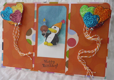
I’m into easy lately and this card is no exception. I started with a 8.5x11 piece of white cardstock and folded it in half. I layered a 5.5x8.5 piece of patterned cardstock on top. Then I took a third piece and cut it into three pieces. One was 5.25x2.5 and the other two were 5.25x2.75 inches. The two sidepieces had a half of a 1.5-inch circle punched out of their “center” sides. All the orange pieces were edged with Ripe Persimmon Distress Ink. I used my ATG to glue all the layers down and my ½ inch corner rounded to clip the two top corners.
The balloons on the outside panels were a digi image that I painted with Stickles (Picket Fence, Firefly, Orange Peel, Ruby Slippers, True Blue, Yellow) and fussy cut out. I then used some mini and macro Glue Dots to hold the pieces of twine to the back of the balloons, knotted the other end and adhered that with another Glue Dot. An Action Wobble backs each balloon cluster.
The center panel has a 2 1/8x4 inch white cardstock that was brayered with Broken China and Faded Jeans Distress Inks, had its top two corners rounded with the ¼ inch rounder, and was glued down. The penguin (another digi image) was colored with my Copics: R35, Y17, Y06, Y15, E11, E23, E25, E27, B32, B34, C9, and W8. He is also mounted on a Wobble. (I attached it to the digi first and trimmed around the image so you wouldn’t see the Wobble.) Finally, a Happy Birthday stamp and the card is good-to-go.
Pin ItThursday, February 16, 2012
Happy Birthday!
We have so many February birthdays in my family, it seems that's the only kind of card I can even think of during this time. For this card I broke out my trusty Cricut Imagine . This is my go to machine when I need something done quickly. The octopus is from Birthday Bash, but I filled it with colors and patterns from one of my Imagine cartridges.

I thought this little octopus was perfect for a peachy keen face stamp, so I added one and I think she looks so sweet. Cutters Creek sells a couple of different face stamp assortments from Peachy Keen and they're perfect for adding just the right facial expression to your die cuts. To finish my octopus off and give her some style, I added some faux stitching with one of my copic spica pens. I wish you could see the shimmer more in the picture it's just the right amount of bling. I also went over her face to give that a little more shine too. No self respecting octopus would head off to a birthday party without the perfect accessory and I though she would look adorable with a flower on her head. This little lily from Cutters Creek's own brand of flowers was just the perfect touch. The final element for my octopus was to attach her to the card with an action wobble so she can move like a real octopus. I finished the card off with some more faux stitching and a sentiment and it's ready to be sent off!
I thought this little octopus was perfect for a peachy keen face stamp, so I added one and I think she looks so sweet. Cutters Creek sells a couple of different face stamp assortments from Peachy Keen and they're perfect for adding just the right facial expression to your die cuts. To finish my octopus off and give her some style, I added some faux stitching with one of my copic spica pens. I wish you could see the shimmer more in the picture it's just the right amount of bling. I also went over her face to give that a little more shine too. No self respecting octopus would head off to a birthday party without the perfect accessory and I though she would look adorable with a flower on her head. This little lily from Cutters Creek's own brand of flowers was just the perfect touch. The final element for my octopus was to attach her to the card with an action wobble so she can move like a real octopus. I finished the card off with some more faux stitching and a sentiment and it's ready to be sent off!
Monday, February 13, 2012
Rockin' Birthday Card with Lori
I have a special birthday card I want to share with you today. My big brother turned 55 earlier this month, and you might not think we have much in common since he is the oldest and I am the youngest. But he was my first "bad influence", introducing me to Godzilla movies and Saturday Night Live, The Beatles and Pink Floyd, and Star Trek and Isaac Asimov. (Come to think of it, I think I can blame him for my lack of popularity in high school, and my extreme popularity in college, lol.) And thanks to his guitar-learning efforts, I never want to hear the song "Smoke on the Water" again. But I wanted to let him know that even though he's now eligible for a senior discount a lot of places, he's still a pretty cool guy.

The pattern papers are both from Echo Park Paper - the polka dots are from A Boy's Life and the navy stripes are from the Dots & Stripes Metropolitan collection. The center panel is kraft cardstock, stamped with the guitar image, embossed with an embossing folder, then inked with Distress Inks. I stamped a second guitar image, cut out the guitar only and adhered it using dimensional adhesive. Everything is layered on a kraft card base. Finally, I used my old school Dymo label maker to create the sentiment and adhered it on top.
I love the look of the Distress Inks on the kraft cardstock. I thought I would show you the difference in the same colors on white cardstock versus kraft.
 I used Faded Jeans, Peeled Paint, and Ripe Persimmon (from the Fall seasonal set) on both sheets. you can see that the darker tone of the kraft brings out the darker tones of the distress inks, where the white seems to brighten them up a bit. Experiment with your favorite cardstock colors as a base and see what happens!
Products available at Cutters Creek:

The pattern papers are both from Echo Park Paper - the polka dots are from A Boy's Life and the navy stripes are from the Dots & Stripes Metropolitan collection. The center panel is kraft cardstock, stamped with the guitar image, embossed with an embossing folder, then inked with Distress Inks. I stamped a second guitar image, cut out the guitar only and adhered it using dimensional adhesive. Everything is layered on a kraft card base. Finally, I used my old school Dymo label maker to create the sentiment and adhered it on top.
I love the look of the Distress Inks on the kraft cardstock. I thought I would show you the difference in the same colors on white cardstock versus kraft.

Products available at Cutters Creek:
- A Boy's Life Collection Kit, Echo Park Paper (NEW!)
- Tim Holtz Distress Inks from Ranger, Peeled Paint and Faded Jeans
- Joy Foam Pads or ASI Kool Tak 3D Clear Foam Squares
- Scotch ATG Adhesive Refills
- embossing folders
Saturday, February 11, 2012
My Minds Eye Paper Pads
I just got my 6 of the 8 new My Minds Eye 6" X 6" paper pads from Cutters Creek and just had to share them with you. While I am a newbie to doing video's I am sure I will get better as I go along. I hope you love the paper pads as much as I do. Take a look.
Friday, February 10, 2012
A Valentine Card For My Sweetie with Chris

I just love Spellbinders. Mix and match or use them alone, they make simple cards look so elegant. This is a 4.25x5.5 top folded card. I started with the Cuttlebug Swiss Dot embossing folder and ran through a 4.25x5.5 piece of white cardstock. Using my ATG, I adhered it to the front of the card. I then took my Spellbinders Borderabilities edge (Lotus Border Petites), lined it up along the bottom edge of the card, and used some removable tape to hold it in place while I ran it through my Big Shot. Since it was a double thickness of paper, I ran it back and forth a couple of times.
I then took my Spellbinders Shapeabilities (Fancy Tags Two) and cut a piece of red vellum and very carefully used my Tim Holtz Craft Pick to remove it from the die. I glued this to the front of the card with my zig pen (I knew I would be covering it, so I wasn’t worried about seeing glue streaks). Next I used my stylus tool to rub on a Valentine’s Be Mine that I had in my stash and added my Nestabling that I’ve been hoarding, to the label.
I wish I had bought the Imaginisce I-Magicut Ribbon Cutter when Kim first offered it because, of course, the ribbon I choose to back up my border frayed. Guess what is now on my wishlist with Kim!
Hope you and your loves have a wonderful Valentine’s Day.
Wednesday, February 8, 2012
Two Quick Valentine Cards with Chris
I’ve neglected my Copics too long and decided that Valentine’s Day was a perfect day to play with some of the colors. Here are two quick cards I colored.


The second card is cut as 5x5 card (10x5 folded at top edge). The layered base is a dryer sheet that I cut to 5x5 and sprayed with Tattered Angels. Rum Punch, Jingle Bells, and Santa Baby. I folded my card in half and ran it through my xyron. I pressed the dryer sheet onto the sticky front of my card and quickly sprinkled it with some pink glitter. (Be sure to press the glitter down to get at the glue and tap off the extra glitter.) I cut and embossed another Heart Square and layered my image (cut and embossed with Spellbinders Classic Squares) on top. Easy peasy—two cards done for the grand kids.
Copics:
Reds= R 22, 24, 27, 29
Greens=G 12, 14
Browns= E 53, 55, 57
Grays= C 5, 7
Resources from Cutters Creek:
Copics
Spellbinders Nestabilities: Classic Squares, Deckled Rectangles, Heart Squares
Doodle Twine: Brights
Distress Inks: Barn Door
Glue Dots Pop UP
Tattered Angels Glimmer Mists: Rum Punch, Jingle Bells, Santa Baby

The first one is cut as a 3.5 x4.5 card (7x9 folded at top edge). I layered a scrap of pink paper on the front and then cut the largest Spellbinders Heart Square out of a coordinating paper and cut it diagonally to mat my digi image. The image was cut and embossed using Spellbinders Deckled Rectangles. I rubbed the edge with some Barn Door Distress Ink, wrapped some pink twine around the bottom edge and popped it up off center so the heart mat would show.

The second card is cut as 5x5 card (10x5 folded at top edge). The layered base is a dryer sheet that I cut to 5x5 and sprayed with Tattered Angels. Rum Punch, Jingle Bells, and Santa Baby. I folded my card in half and ran it through my xyron. I pressed the dryer sheet onto the sticky front of my card and quickly sprinkled it with some pink glitter. (Be sure to press the glitter down to get at the glue and tap off the extra glitter.) I cut and embossed another Heart Square and layered my image (cut and embossed with Spellbinders Classic Squares) on top. Easy peasy—two cards done for the grand kids.
Copics:
Reds= R 22, 24, 27, 29
Greens=G 12, 14
Browns= E 53, 55, 57
Grays= C 5, 7
Resources from Cutters Creek:
Copics
Spellbinders Nestabilities: Classic Squares, Deckled Rectangles, Heart Squares
Doodle Twine: Brights
Distress Inks: Barn Door
Glue Dots Pop UP
Tattered Angels Glimmer Mists: Rum Punch, Jingle Bells, Santa Baby
Tuesday, February 7, 2012
Tuesday Tutorial


I then cut a mat from the Elegant Edges Cricut Cartridge (I believe Kim can special order this if you are interested) out of the photo paper and also from a dark burgandy scrap paper for the shadow. For my card base, I started with Kraft card stock I cut, scored and folded to make a 4 1/4" X 5 1/2" card stock base. I then cut a mat our of the same burgandy card stock 4" X 5 1/4" and then cut a mat from the Prima Botanical 6" X 6" paper pad. For the image on my card I used an image from the Morehead Decoupage Ecstasy Craft line. While the particular set I used is not available the Ecstasy Craft images are great to put together a quick card. Check out the dimension you get once you are done layering the image.

I really love how the photo paper turned out and it works great with my image and paper. What a great way to create custom back grounds for your images. I hope you will give it a try and tryout the Ecstasy Craft line.
Pin It
Monday, February 6, 2012
What's New At Cutters Creek?
Hello, Everyone! Today I thought I would take a few minutes to show you a few of the products that are coming to the Cutters Creek Store, fresh from CHA! These are a few of the products that I can't wait to get into my hands.. you can check out ALL of the new additions by clicking HERE! *Please note that the expected ship dates are listed in the individual product posts*
First up are the new Graphic 45 papers: Olde Curiosity Shoppe, Little Darlings and Kraft Reflections:

To see the individual papers in the Olde Curosity Shoppe line click HERE and HERE.

To see the individual papers in the Little Darlings line click HERE and HERE.

To see the individual papers in this line click HERE.
Next on my list are the NEW Copic colors... aren't these delicious?

You can purchase them as a set by clicking HERE or individually from THIS link.
Another thing I can't wait to try is...

...the new Spectrum Noir Alcohol Ink Markers from Crafter's Companion. I know they won't replace my Copics anytime soon, but they sure are a nice, cheap addition to help round out my collection. We look forward to giving these a test run very soon! Just click HERE to order up a set to try for yourself.
Finally the last thing on my MUST list is this:

That's right, the Imaginisce I-magicut Ribbon Cutter. If you click HERE it will link you to the video that shows how to use it. After you've watched the video and realize this is a MUST HAVE tool, you can click right HERE to order one! This one is on it's way to me right now! And I will be posting MY trial runs with it, right here on the blog. For those of you that don't know, I hoard my fair share of ribbon... and probably actually a LOT more than my fair share, LOL! I'm looking forward to no more frayed edges!!!
Well, that's all from me for now, but check back often! Or just sign up for the e-mails and have every blog post sent straight to your Inbox, so you won't miss a thing!
First up are the new Graphic 45 papers: Olde Curiosity Shoppe, Little Darlings and Kraft Reflections:

To see the individual papers in the Olde Curosity Shoppe line click HERE and HERE.

To see the individual papers in the Little Darlings line click HERE and HERE.

To see the individual papers in this line click HERE.
Next on my list are the NEW Copic colors... aren't these delicious?

You can purchase them as a set by clicking HERE or individually from THIS link.
Another thing I can't wait to try is...

...the new Spectrum Noir Alcohol Ink Markers from Crafter's Companion. I know they won't replace my Copics anytime soon, but they sure are a nice, cheap addition to help round out my collection. We look forward to giving these a test run very soon! Just click HERE to order up a set to try for yourself.
Finally the last thing on my MUST list is this:
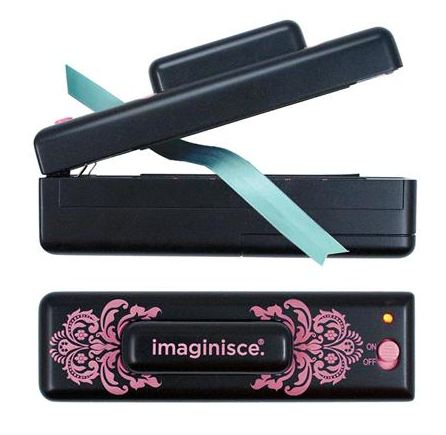
That's right, the Imaginisce I-magicut Ribbon Cutter. If you click HERE it will link you to the video that shows how to use it. After you've watched the video and realize this is a MUST HAVE tool, you can click right HERE to order one! This one is on it's way to me right now! And I will be posting MY trial runs with it, right here on the blog. For those of you that don't know, I hoard my fair share of ribbon... and probably actually a LOT more than my fair share, LOL! I'm looking forward to no more frayed edges!!!
Well, that's all from me for now, but check back often! Or just sign up for the e-mails and have every blog post sent straight to your Inbox, so you won't miss a thing!
Saturday, February 4, 2012
K&Company Smash Book Tour With Kim B
Since a lot of the Design Team has shared their Smash Book with you by K&Company, I decided to do a video and share mine too! I hope you enjoy my little tour and all these items can be purchased in the Cutters Creek online store. Enjoy! And please feel free to leave me a comment or ask any questions.


Subscribe to:
Posts (Atom)


