I started with the Miss Caroline Dilly Dally paper pad and this weeks sketch from Mojo Monday. --Just an FYI, I am the Queen of Sketches! I love to take a sketch or pattern and use it to make my own creations. Sometimes I will just use it for the basic idea and completely change things up, but other times I will use it pretty much as is to make my life easier. So, as I was recovering this week from a self-inflicted foot injury, I decided the easier my life, the better! Here's the sketch I used for my two cards:
Using this sketch, I decided to make one masculine and one feminine card. I left them sentiment-free for now so I can use them for whatever in the future. Since the MME papers are double-sided, I used a single sheet of paper for each card (plus a small scrap for my flower center). I made my cards 5" x 7", as I prefer the larger size, and cut each panel to 3" x 5". So, here are my two cards:
Even with the same overall design, kraft base, and distressing, I think they look pretty different. The difference is all in the pattern paper I chose from the pad and the additional supplies I chose to use with them.
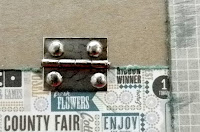
For a more masculine look, I chose a more graphic paper, with a fairly simple pattern on the other side. I added metal embellishments, which I distressed with a W5 Copic Marker.
I added trims in basic neutral colors, leaving frayed ends on the ric-rac and tying a simple knot in the hemp cord. My additional embellishments were basic tickets, repeating the graphics from the paper without adding anything frilly.
For the more feminine look, I chose a floral pattern with a happy polka dot on the back side. I added some vintage crochet trim, sparkly glitter tape, and some paper flowers colored with Glimmer Mist. The flower center is a clear button backed with a paper scrap and a few Kaisercraft Pearls in the center. To enhance the feminine look even more, you could leave off the distressing and sponge the ink around the edges of the papers rather than the direct-to-paper techniques I used. But I love a vintage look, especially paired with sparkly bling, so I kept the distressing. It reminds me a bit of my grandmother's kitchen!
I hope you enjoyed today's cards! If you decide to follow my lead, I'd love to see your cards too. You can snap a pic and send them through to the Cutters Creek Yahoo Group where we can all ooh and ah over them!
Supplies used for these two cards:
- My Minds Eye 6" x 6" paper pad, Miss Caroline Dilly Dally
- Tim Holtz Distress Ink, Tea Dye, Fired Brick and Evergreen Bough (Winter LE set)
- American Crafts Glitter Tape (currently a club-only item)
- Stampers Anonymous - Tim Holtz stamps, At The Movies
- Glimmer Mist, Patina
- Copic Marker, C5
- Glue Dots
- ATG adhesive
- Kaisercraft Pearls in Yellow
- Scotch Pop-up Foam Squares


Both your cards are amazing!!
ReplyDeleteLori you certainly inspired me with your creations. I love the fact of using one piece of paper for each card. I love double sided paper for that specific reason. It really helps deciding on the colors and the elements.
ReplyDeleteGreat projects! Hugs, Fran